by bungalow101 | Jun 16, 2023 | Other areas
INTERIOR DESIGN FOR THE CRAFTSMAN HOUSE
 Gustav Stickley brought Arts & Crafts to America from Europe in the early 1900’s. He carried with him both the aesthetic & the philosophy of the Movement, & then did it his way, inspired by the simplicity of the log cabin. He was considered to be the leading authority on architecture, gardens & interior design for the Craftsman house. Should you wish to learn more about Stickley, check out these videos that I have collected about him & his work.
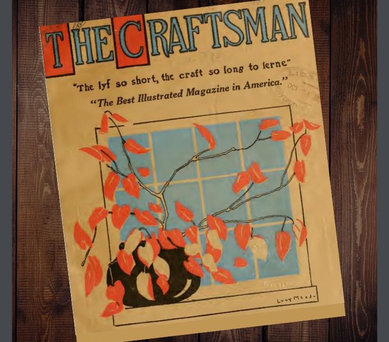
In addition to making & selling furniture, he created a monthly magazine, The Craftsman, “An illustrated monthly magazine edited & published by Gustav Stickley in the interests of better art, better work & a better & more reasonable way of living.”
The magazine was a beautiful vehicle for spreading the word about the American Arts & Crafts Movement as well as promoting his furniture & his stores. It contains articles about the English founders of the Movement, John Ruskin & William Morris & was a key influence on the culture from 1901-1916 at which point it merged with another publication, Art World.
There is a wonderful article about the magazine & its contributions here. I strongly urge you to read it because it tells the full tale of how forward thinking, profound & inspiring Stickley’s beliefs & work really were. These lessons are applicable today, perhaps even more so than they were 100 years ago.
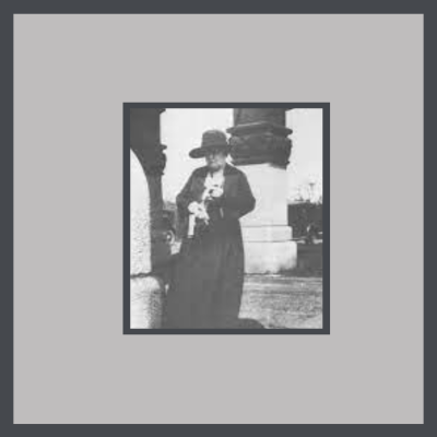 Most folks think that the articles in The Craftsman were written by Stickley. Not so. He was a businessman with a large operation to oversee so he employed talented people to create his products & his P.R.
When Stickley founded The Craftsman magazine in 1901, Irene Sargent, an art historian & Syracuse University Professor, wrote nearly all of the first 3 issues & thereafter wrote at least the publication’s lead article as well as serving as managing editor & designing layouts. Her writing & the images she chose, taught the public about the American Arts & Crafts Movement & also its predecessor in Europe & in America.
Between 1901 & 1905, Sargent wrote over 80 articles for The Craftsman, shaping the taste of America. The article below, on interior design for the Craftsman house, is stated as being “Editor’s Notes” in the table of contents for the issue. I am assuming that it was written by her, but it may have been written by Stickley himself. It’s a good introduction to the subject of interior design appropriate to our bungalows. In fact, the article was an introduction to the style for most Americans, being part of the first ever published magazine.
Enjoy!
AN ARGUMENT FOR SIMPLICITY IN HOUSEHOLD FURNISHINGS, by Irene Sargent
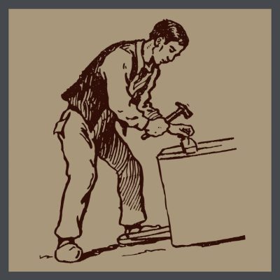 In all that concerns household furnishings & decoration, present tendencies are toward a simplicity unknown in the past. The form of any object is made to express the structural idea directly, frankly, often almost ‘with baldness. The materials employed are chosen no longer solely for their intrinsic ‘value, but with a great consideration for their potential beauty. The qualities thus apprehended are traced to their source & then carefully developed by the skill of the craftsman.
In the eighteenth century, the French cabinet makers created charming objects suited to the palaces & castles of the old nobility. They reveled in richness of material: in woods brought from countries & colonies difficult of access; in costly gilding & other applied ornament; in fanciful painting which exquisite delicacy of handling alone saved from triviality & insignificance.
But to-day, with the idea of development everywhere dominant,—in the sciences, in educational methods, in all that furthers human intercourse, comfort & progress—we find the mood of the century impressed upon the material & necessary objects by which we are surrounded. Even our beds, tables & chairs, if planned & executed according to the newer & sounder ideas of household art, offer us a lesson taught by their form, substance & finish. We are no longer tortured by exaggerated lines the reasons for which are past divining. We have not to deal with falsifying veneers, or with disfiguring so-called ornament. We are not necessarily confronted by substances precious because of their traditional use, their rarity, &the difficulty attending their attainment.
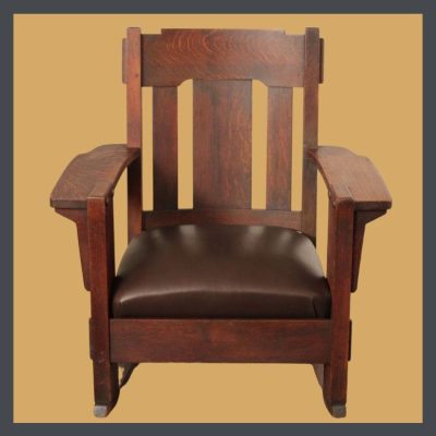 We are, first of all, met by plain shapes which not only declare, but emphasize their purpose. Our eyes rest on materials which, gathered from the forests, along the streams, & from other sources familiar to us, are, for that reason, interesting & eloquent. We may, in the arms of our reading-chair, or in the desk before which we pass our working-day, study the sinking undulations in the grain of oak, ash, elm, or other of our native woods, & in so doing, learn the worth of patient, well-directed & skilled labor; of that labor which educates; that is: leads out & develops the hidden Values & qualities of things too often neglected because they are frequently seen.
THE END
Stickley, the father of the America Arts & Crafts Movement, lovingly interpreted our country’s aesthetic in his newly invented medium of the time, the Craftsman style. Should you wish to know more about him, I heartily suggest that you watch the wonderful documentary, Gustav Stickley: American Craftsman.
TIP: Move right along onto Part 1 of this series on interior design for the Craftsman house.
 STAY IN THE BUNGALOW KNOW!!!
Sign up for our newsletter & receive our FREE E-book, 7 VITAL Things to Do Before You Hire a Contractor.
by bungalow101 | Jun 15, 2023 | Other areas
THE FIRST VITAL STEPS IN DESIGNING YOUR BUNGALOW’S INTERIOR
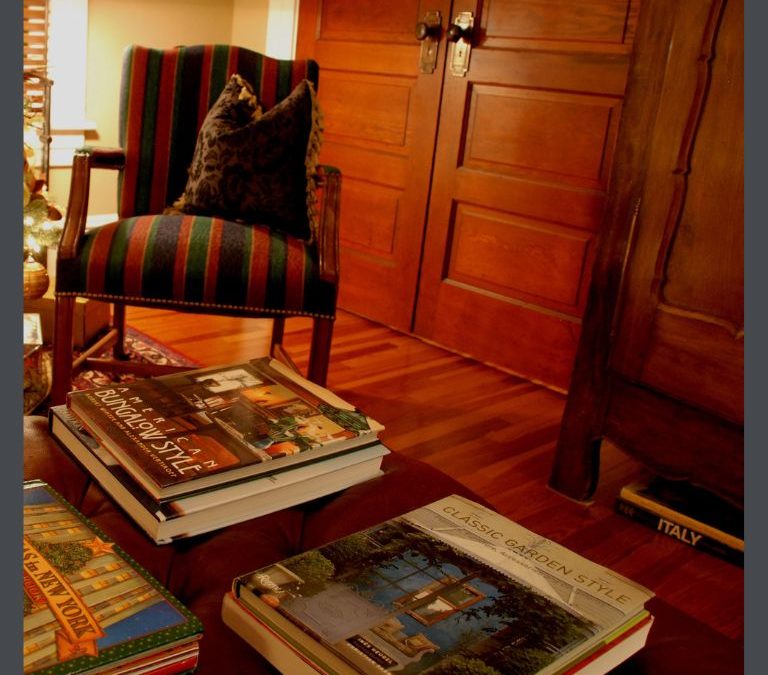
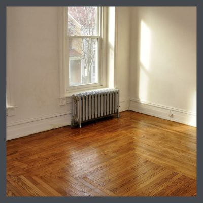 Here you stand, in your new, empty house. Perhaps you were fortunate to buy a house that needed little restoration, or perhaps you’ve been working for months to rescue it from a tragic combination of remuddling & neglect. And now the paint is dry, the floors are gleaming & the windows slide up & down.
Either way, it’s a blank slate. How do you even begin to fill it, making these echoing spaces a welcoming, rejuvenating home that serves your needs & pleases your eye? And fits your budget.
This series of articles will walk you through the process. Each article builds upon the ones previous, so start here, & read sequentially.
The choices can seem overwhelming so where do you start? You may have received mountains of advice from various sources- family, online, the “experts” on HGTV & find much of it to be contrary & some of it downright nonsensical.
But, hey! This your house- your retreat, your communication & above all, it must serve your needs well. So, your first task is to determine your own needs.
YES, YOUR NEEDS! YOUR PREFERENCES! YOUR HOUSE!!!
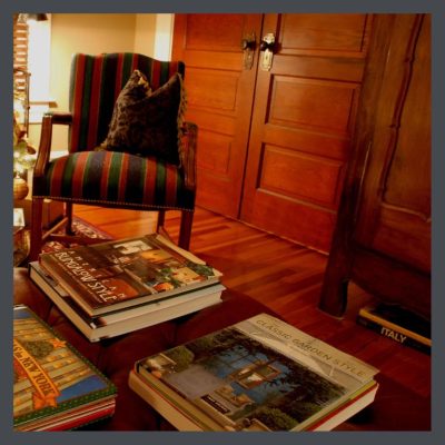 Most of my friends are very house proud- artists, interior designers, architects, bent on creating magazine-worthy homes & they have the skills to accomplish this.
However, one of the most beautiful Arts & Crafts houses I have ever seen was the spacious home of a large family. Built in the early teens by a man who owned a lumberyard, it was a glorious display of woods from all over the world. Every room was clad in a complementary mixture of species of the American forest- oak, maple, walnut, cherry, Douglas fir, redwood, chestnut.
A magnificent staircase of a multitude of woods greeted you upon entry.
Throughout the house there were softly gleaming floors, wainscoting, box beam ceilings, wide window & door trim, box beam ceilings.
Truly one of the finest houses I had ever had the pleasure to view, it was regarded by the homeowner simply as a home in which to rear her family. The perfect setting for the most collectable Arts & Crafts furniture, textiles & lighting, it resembled a daycare rather than the A&C showplace it could have been because that was the ambiance that best served this warm, happy, child-centered family.
GETTING STARTED DESIGNING YOUR BUNGALOW’S INTERIOR SPACES
Your first step is to determine your own needs & the needs of your family. (Mine are in parentheses below each question. I have included them not to influence you, but to serve as a reference when I making choices in putting rooms together in future articles.) These needs can be complex. Fortunately the layouts of bungalows, with their distinct, separate private & public spaces, can accommodate these needs. Some things you should consider are:
- If you have children, how can they have space to be kids & learn to handle their bodies without destroying the environment? (Nope, & I did not invite small children to the Hare house. My beautiful quartersawn oak floors were very thin & delicate as were the leaded glass doors of my built-ins, some of which were at floor level. My Tampa house was sturdier & I was happy to have children of all ages bouncing around in it, & often did!)
- How can your home comfort & recharge you? Is your greatest joy found in being in the kitchen preparing gourmet meals? Do you draw inspiration from being surrounded by beautiful objects? Is your house mostly a closet or a sports storage facility that you visit only to sleep & prepare for your next adventure? (My home is my point of orientation to the rest of the world. It must be beautiful & filled with objects that delight me. It must bring comfort & gladness to those who enter. In years past, it needed to provide space for a committee to meet, munch on snacks & plan events & occasionally, mischief. It must teach.)
- What furniture & accessories will come with you? Do you like them? Which are your favorites? (To the Hare house, I brought little. I moved from a Mid-Century house & sold my collections. I started from zero. To my Tampa house I lugged rugs & art. My master bedroom came fully intact, confusing those seeing it for the first time, who had come upon it in Jame Powell’s BUNGALOW: THE ULTIMATE ARTS & CRAFTS HOME.)
- What is your budget? Buying a house & moving are expensive & restoration costs can be high. You will probably need to create your interior over time so you need to decide on your priorities. (I tend to overspend & do not recommend it to anyone!)
- Will you decorate room by room? Will you hit the basics & embellish later? (I furnished both bungalows pretty quickly, but embellished for years. I hated my Tampa living room couch & it took me 5 years to find a set I wanted. (And then my cat peed on it which is why I have no photographs!)
- What are your skills? Are you handy with a saw, a hammer, a paintbrush? Do you have a natural aptitude for learning these skills? Are you willing to learn? (No. My skills are in design & I am too fussy to learn construction skills. I am really good at assembling a skilled team & coaxing them through projects, educating them about preservation as we go. I taught my handyman to to restore windows!)
- What are your physical capabilities? (Uh….)
- How much time do you have to devote to the creation of your home? How much attention? (Like with $$$, I devote way too much time to my house, but, every morning I wake up & fall in love again.)
- Who will help & support you? Who will oppose you & how will you deal with that? (I’m a fortunate woman to have had a supportive mother & extra-supportive husband. I have educated my friends in historic preservation & made new ones who are as dedicated as I. I have learned much from them.)
- What are your favorite colors? Color theory is discussed here, but I always suggest that you start with what you love. (I love purple & you will see in my color articles that I justify the use of purple in Arts & Crafts decor. I love how tones of purple combine with the natural hues of the Movement & dream of ways to use it. Just picture appliqued irises on a linen pillow!)
The above exercise in designing your bungalow’s interior spaces may take you 10 minutes to do or it may take you 10 hours, but, looking into your own heart before making decisions is the best way to protect that heart.
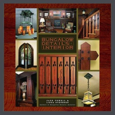 After you have answered these questions, read my article on Jane Powell’s book, BUNGALOW DETAILS: INTERIOR. I highly recommend that you read this book because it will guide & inspire you.
Part 2 in this series will cover some basic design points as applied to the bungalow, taking you from the general, as described in the Introduction, to the specific. As we move along, I’ll link to other articles to read to embellish the information.
Let’s make your home beautiful!
 STAY IN THE BUNGALOW KNOW!!!
Sign up for our newsletter & receive our FREE E-book, 7 VITAL Things to Do Before You Hire a Contractor.

by bungalow101 | Jun 14, 2023 | INSIDE, Other areas
BASIC DESIGN FOR A CRAFTSMAN HOUSE INTERIOR
 What is interior design? It is a combination of art, science & technology that is employed to enhance the quality of our lives. It is also about understanding how people operate in a space in order to make it functional. In this article, we’re going to look at the elements of basic design for a Craftsman house interior
When you’re talking about interior design in a bungalow, you must add history & philosophy, & you must also consider the science of that time as well as the technology & the materials that were available then. For example, the main parts of a house are built with wood- both structural & decorative. The wood available at that time was from old-growth forests. These were decimated over a century ago.
However, though times have changed, basic design theory has not. Let’s go through the basics, starting with the 8 elements, the word element being defined by Oxford as, “a part or aspect of something abstract, especially one that is essential or characteristic.” Example: “The death had all the elements of a great tabloid story.”
So let’s take a look at the parts/basics/rudiments of creating visual harmony- space, line, form (shape), pattern, light, texture, scale & color- to see how they relate to the Arts & Crafts Movement & how to apply them to your bungalow. Then we’ll trot through the principles of design in which you will combine these elements to create a home that pleases you, suits your needs & is within your budget.
USE OF SPACE IN BUNGALOW INTERIOR DESIGN
When we’re talking about space in interior design, we’re not referring to Buzz Lightyear, nor Howard Wolowitz, the creepy astronaut from Big Bang theory. Space, as applied to creating visual harmony in interiors is a 3 dimensional concept- simply the length, breadth & height of the room.
There are 2 types of space we must consider in our planning.
Negative Space
 Negative space is the area around & between objects, what we usually think of when we say space. It allows our eyes to pause & to see objects individually. With the use of negative space, the eye gets a rest.
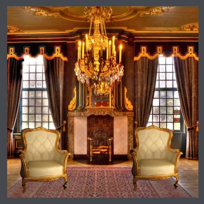
When you look at Victorian room, you see little negative space. You are assaulted by color on color, pattern on pattern. The Industrial Age made this aesthetic possible with its introduction of mass production. Whereas it may have taken weeks or months to manufacture a single chair by hand, with machines, 100s of chairs could be cranked out in a single day. Ditto for textiles- draperies, rugs, pillows. Add accessory pieces to that & you get a highly ornate room, with no negative space. Even the windows are topped with valences, then heavy ceiling to floor curtains hang down in complex patterns, & are tied back with big, fluffy tassels.
Looking up, the ceiling features a gilded center medallion & multiple moldings. Following downward we may see perhaps 3 more ornate patterns & a fireplace with more curlicue carved moldings before our eyes drop to an oriental rug featuring still more colors & designs. And plopped on the rug is an abundance of furniture, again carved & again gilded.
Whew!
LESS IS MORE WHEN DESIGNING A BUNGALOW
Enter the Arts & Crafts era, with its protest against the excesses of Victorian design coupled with its elevation of craftsmanship. If you haven’t read the Introduction, take a moment now to do so because in the article there, AN ARGUMENT FOR SIMPLICITY IN HOUSEHOLD FURNISHINGS written in 1901 by one of the foremost influencers of the time, explains the aesthetic beautifully.
The founders of A&C Movement revered nature. When you get that uncomfortable feeling that you need some space, you head outdoors to open vistas & soaring skies- the peace & serenity of negative space. In Arts & Crafts design, each object gets its own space. Perhaps an object is part of a vignette, but individual groupings are displayed respectfully giving each one importance.
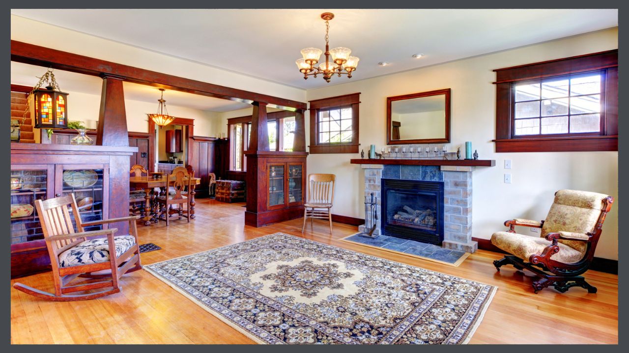
Prior to the Industrial Age other than for the very wealthy, minimalism was a necessity born of scarcity. With the Movement, especially in America with the influence of Stickley, interiors once again became simple & uncluttered. Negative space.
My mother taught me this concept when I was but a wee one. She pointed out to me a piece of jewelry sitting alone in a glass case in a museum. She explained that giving the piece space around it forced you to consider it alone & distinctly communicated its grandeur & high value.
Positive Space
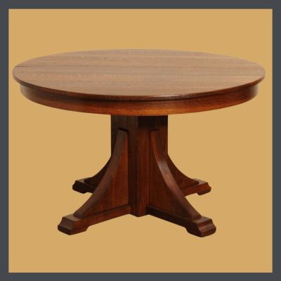 Positive space is the areas defined by objects- architectural details, furniture, textiles, artwork, lighting. The areas are where you want to direct the eye. Which objects you choose & how you place them will determine how the space will feel. Here you can employ all the rest of the elements- form, color, light & texture- to create a mood, tell your story, & enhance the existing features of your bungalow, as well as creating a space that will serve you & your family well.
The well-know statement here by William Morris, “Have nothing in your house that you do not know to be beautiful or believe to be useful,” is a good guide here in creating a visually pleasing positive space. Should you not have the funds to buy beautiful things, please do not be tempted to buy objects to just fill that space. Rattle around in it until you are lucky or clever enough to acquire things that you truly love.
 Using the correct balance of positive & negative space will help you achieve the look that you want. Like the yin & yang of ancient Chinese philosophy, positive & negative spaces are opposite but complement or complete one another & interrelate to form a whole.
An empty room is nonfunctional unless you like to sitting on the floor. It echoes & feels a bit lifeless & depressing. You instinctively want to add something to it!
A cluttered room is often just as nonfunctional. Just watch an episode of Hoarders! It is difficult to keep clean & orderly & your first instinct is to think about getting rid of some of the excess.
Well, it’s my reaction anyway!
THE IMPORTANCE OF LIGHT IN A BUNGALOW INTERIOR
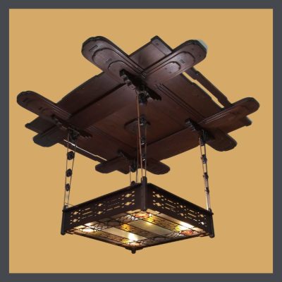 Light is a vital aspect of any space. A key characteristic of bungalows is that they tend to be on the dark side. Their shady porches & deep overhangs made them bearable before air-conditioning & their dark wood can feel oppressive prompting people to pull out the paintbrush. (Put it down, please.) Once against, contrast creates interest here & the correct use of color & lighting will make your house more livable & lovely.
If you want to learn more about lighting, please visit my illuminating series of articles that cover this subject.
Even without a spectacular feature by Greene & Greene!
You can read more about Arts& Crafts lighting here.
In Part 3 we’ll take a look at some of the other elements of interior design & consider how they relate to the enhancement & enjoyment of your bungalow!
 STAY IN THE BUNGALOW KNOW!!!
Sign up for our newsletter & receive our FREE E-book, 7 VITAL Things to Do Before You Hire a Contractor.

by bungalow101 | Jun 13, 2023 | Other areas
 INTERIOR DESIGN FOR A CRAFTSMAN HOUSE -More Elements
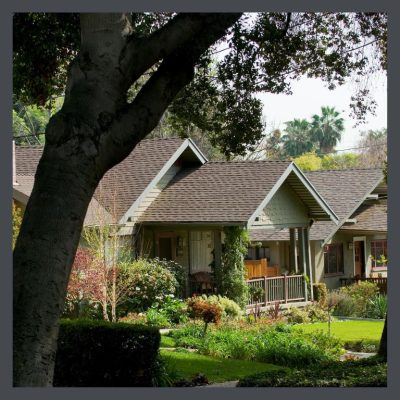
One of the things that I love the most about the interiors of A&C homes is that though similar, each one is made distinct by the choices made in playing various design elements, one with another. Visiting the homes of Bungalow Heaven on its annual tour is a great example of this. The houses, one to the next are highly distinct, while their similarities contribute to the allover character of the neighborhood. These elements are all crucial in planning the interior design for a Craftsman house- its functionality & its charm.
So let’s continue our look at the parts/basics/rudiments of creating visual harmony, a continuation of those elements from Part 2., & how they relate to your bungalow. Differing uses of each design element make each interior wholly itself & part of the fun is in identifying those unique bits.
USE OF LINES IN INTERIOR DESIGN FOR A CRAFTSMAN HOUSE
Lines help to delineate the space in a room & guide the eye. Using lines, you can change the perceived space of a room, you can direct attention to your focal point & tell a visual story by directing attention.
Horizontal lines give a sense of solidity, stability & efficiency. You do not have to look far in the Arts & Crafts Movement to see horizontal lines. The work of Frank Lloyd Wright, the Greene Brothers & Stickley all emphasize the horizontal, expressing a turning away from the frivolity of the previous era. Our bungalows exteriors are defined by their low, horizontal shapes.
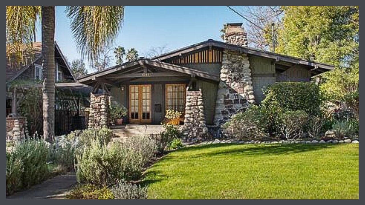
Vertical lines inspire a sense of freedom & strength- think churches of all periods.
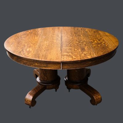 Dynamic lines create a feeling of energy & movement. These lines are found most often in the arts & crafts of the Movement, in the portrayal of nature. Pottery, textiles & metalwork feature provide a flowing contrast to the often bulky feel of furniture typical to the period. The juxtaposition of these elements with the horizontal lines of the furniture create interest in a room.
Another place that you find dynamic lines is in the wood grain of the furniture, the flooring & the built-ins. Quartersawn, or Tiger Oak is used heavily in Craftsman furniture, creating its own subtle, dynamic flow of life within the pieces themselves. The graining of the beautiful flooring of Tiger Oak, Douglas Fir or Maple add more of the natural world to the home & several woods, each with their own dynamic grain lines, are often mixed in a house, with flooring of one species, & built-ins of yet another or others.
THE ELEMENT OF FORM IN BUNGALOW DESIGN
Form, a 3-dimensional geometric figure (a cube, a sphere, a cylinder or cone, etc.) as opposed to a shape (a square, a circle, a triangle, etc.) which is 2 dimensional, refers to the shape of the room & any of the objects within it. Shapes are considered to be either geometric, which create a sense of order & structure, or natural/organic which provide movement & fluidity. In the A & C house, we tend to see many geometric forms, in the shapes of the rooms themselves, the furniture, the fireplace, built-ins, the windows & doors. The organic forms of cushions, pottery, pillows, the draping of the window treatments, even the logs in the fireplace create an interesting counterpoint to the geometric objects which ground the space.
USE OF PATTERN IN THE PLANNING OF INTERIOR DESIGN FOR A CRAFTSMAN HOUSE
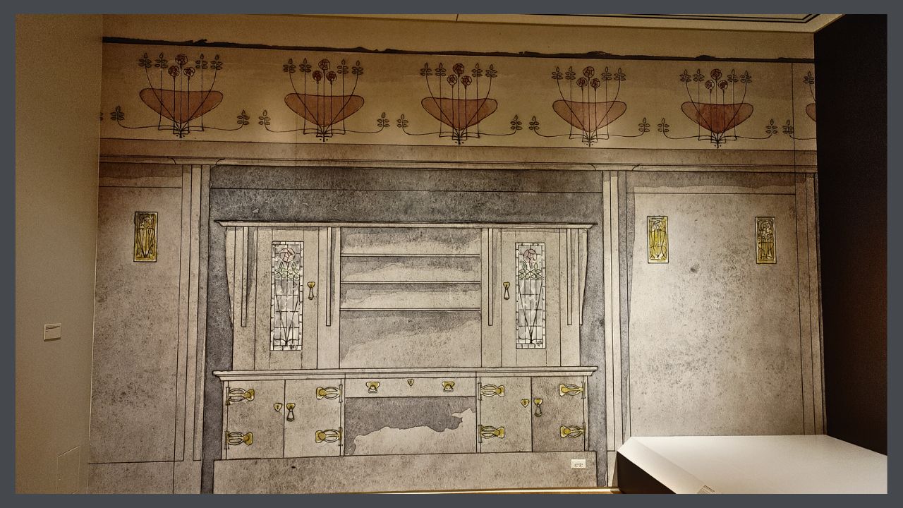
A pattern is a repeating (of shape, line or color) design. Think wallpaper or stencils.
Inspired by nature, the American Arts & Crafts Movement looks very different from that of the earlier, European aesthetic. William Morris was inspired by flowers, while Stickley was a great fan of the log cabin. Each of them based their concept of beauty on the natural world, but their interpretations are hugely dissimilar.
This cabinet rendering above, by Charles Rennie Mackintosh, shows how powerful a pattern can be as it sweeps the eye across the expanse of the entire wall.
THE USE OF TEXTURE IN CRAFTSMAN STYLE
 A home is an intimate space & tactile sensation, interpreted through the skin & the eyes is a key element in design.
Visually, texture helps give a space dimension. Tactiley, it provides comfort or utility.
I love the look & feel of plaster walls with its soft look & imperfections. To me, textureless, flat drywall is hard & cold, machine made & cheap. I love how a wood floor feels under my feet. Linoleum has that nice hint of resilience & on a cold, winter morning, I’m happy to have a rug under my toesies.
Nubby linen curtains over built-in bookcases, flanking a tile fireplace. Smooth pottery with its soft matte glaze complimenting the heavily figured oak mantel. And kitty, playing with her toy on a rug. The natural materials of the Movement- wood, clay & fur, display their textures honestly.
USING COLOR IN YOUR BUNGALOW
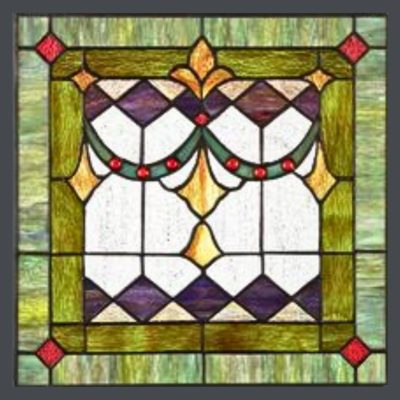 Colors are very powerful in setting tone & influencing mood in the interior design for a Craftsman house. You spend a great deal of time in your home & I think that you might need to review Part 1. THE FIRST VITAL STEPS, in which you considered your needs & wants for your home. Color choices for an invigorating home will be different from those of a home in which you are seeking peace & comfort. For example, the warm colors- red, yellow, orange- are going to stir the blood & are associated with passion. The cool colors are known to lower blood pressure & be calming & soothing. Both of these palettes are appropriate in an bungalow.
The subject of color is well covered in my PAINT series. I suggest that you read the complete series to get a full handle on general color theory A&C color in particular. Because the major paint manufacturers have provided us with historic palettes, many people have the idea that these are the only choices. They are so-o-o-o not.
Take a look at my Pinterest page which shows many fine examples of colors for the interior of your home.
Next, in Part 4., we are going to look at the principles of design- the guidelines for combining these elements when you are creating interior design for a Craftsman house

STAY IN THE BUNGALOW KNOW!!!
Sign up for our newsletter & receive our FREE E-book, 7 VITAL Things to Do Before You Hire a Contractor.
by bungalow101 | Jun 12, 2023 | INSIDE, Other areas
HOW TO DECORATE IN THE CRAFTSMAN STYLE
 My art training consisted of growing up in museums, exposing me to beautiful objects, exquisitely displayed, ballet with its delightful costumery & stage sets, the arts & crafts of the native Americans of the southwest, & the example set by my mother, who had impeccable taste. From a young age, I appreciated beauty but I never had an aptitude for drawing or painting so I never studied art. My taste was formed by what I saw & what my mother taught me. I grew up learning how to decorate in Craftsman style just by osmosis & later, my bungalows were much admired, with 2 of them being featured in books & magazines & on home tours.
Until just a few years ago, I had never studied design or color theory. To be honest, I had the idea that it was a bunch of arbitrary ideas, made up by academics & had no application in real life. Then, away from home, taking care of my mother when my brother was ill, I had some time on my hands & decided to study design theory. What I discovered is that it is actually a body of data based on observation & application. It does have something to do with me! This information validated my natural/environmental aptitude & also taught me much about creating beauty & harmony that I could actually use to help people decorate their Craftsman homes.
We have come to the first lesson about the principles, or basic rules, of creating visual harmony in design. In the INTRODUCTION, we heard from Gustav Stickley who brought the Arts & Crafts Movement to our country from Europe, endowing it with a distinctly American voice. Part 1 is the the soul-searching session, formulated to help you determine what your lifestyle needs & aesthetic preferences are. Parts 2 & 3 break down interior design into its component parts as expressed in the Movement & as you can apply them to your own bungalow. These elements are the puzzle pieces of design & the way that you fit them together, to decorate in the Craftsman style, is found in the principles.
PRINCIPLES OF INTERIOR DESIGN AS APPLIED TO YOUR BUNGALOW
There are 7 principles of interior design: unity, balance, rhythm, emphasis, scale & proportion, contrast, & details, which apply to any home or even to commercial spaces. How do these basics apply to how to decorate in the Craftsman style?
In order to properly familiarize yourself with the decor most complementary to your home, it is important to understand the aesthetic that inspired every aspect of your home’s architecture. Please watch these videos on the Arts & Crafts Movement which will allow you to see many examples & learn the history of your home’s charming character. Following these principles will help you enhance the features that give it its character & help you create a home that is harmonious, gracious & comfortable.
UNITY/INTEGRATION
 These words of Irene Sergent, in the Craftsman magazine, express the unifying message, the unifying theme, of the American Arts & Crafts Movement in interior design,
“We are, first of all, met by plain shapes which not only declare, but emphasize their purpose. Our eyes rest on materials which, gathered from the forests, along the streams, and from other sources familiar to us, are, for that reason, interesting and eloquent.”
It is not imperative that you spend hundreds of thousands of dollars buying antiques to decorate in Craftsman style. Stickley himself strove to produce his wares for the masses. But, your bungalow has a visual message of its own & through your furniture & decor, color, texture & shape choices, you can amplify this message.
USING SCALE & PROPORTION TO DECORATE IN THE CRAFTSMAN STYLE
Scale is defined as how an element relates to the size of the room it occupies.
Proportion has to do with the way an element relates to other things in the room.
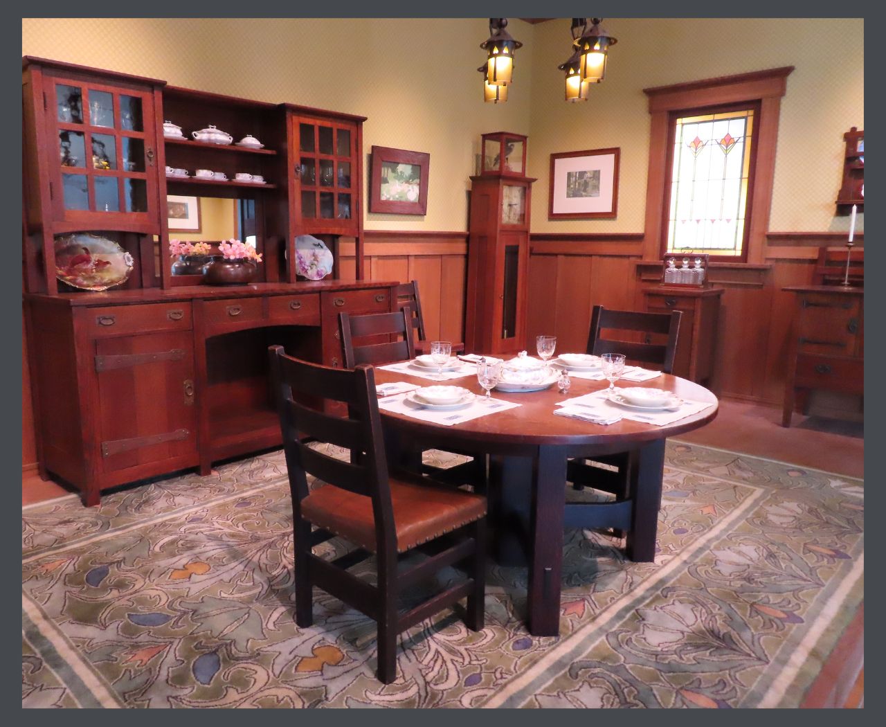
The proportions of this large Stickley dining room are appropriate. Even the pattern on the rug is large as are the pottery & metalwork displayed on the sideboard. This is a great example of how to decorate in the Craftsman style.
I have seen this concept to be tricky in a small bungalow. A petite space requires petite scale furniture, but using a smaller number of medium pieces can also be of benefit. Remember our negative space from Part 2? The key is to maintain enough negative space that each item can be admired easily & you don’t feel like there’s no room for you.
I have a friend who downsized & brought all her more petite pieces with her. And I do mean all. Each object is beautiful & the correct scale for the new condo, but the whole room is just too crowded. There’s no empty space to catch your breath. When I visit her, after navigating my way carefully to the couch, I am distracted from our conversation by my compulsion to silently choose which pieces she should discard!
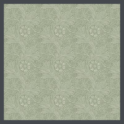 I’m a fan of textiles & encourage the use of simple or low contrast patterns in a smaller bungalow, or room. The Arts & Crafts palette tends to be more muted so it’s a good choice for a house with a reduced square footage, but I still recommend using a more restrained hand in a mini-bungalow. This William Morris pattern, with its muted, pale colors will create a feeling of softness rather than harshly stopping the eye, & would be a good addition to the decor of a smaller space.
In a less expansive room, I’d be inclined to forgo the wallpaper, but a long, frieze (a sculptured or otherwise ornamented band on a wall, near the ceiling) can create space. This lovely one was produced by Grueby Faience of Boston in 1904. Made of glazed earthenware, it would surely draw the eye horizontally, visually lengthening the wall. The term faience was used to describe earthenware with relief molding, which was then decorated with colored glazes. Grueby made a large variety of tiles & pottery in this style.

The repeating pattern keeps the eye moving along, creating visual space. You can create the same effect with a stenciled pattern & learn a new art form too! There are many wonderful A&C stencil patterns that you can find here.
In any size home, you want to make sure that your items are approximate in their sizes. A dinky table with a huge sofa is going to get lost. However, grouping smaller, complimenting items to form a vignette can create balance. This photo of a Gamble House bedroom shows all of the pieces to be in proportion to all the others, from the beds, to the desk to the ceiling fixture.
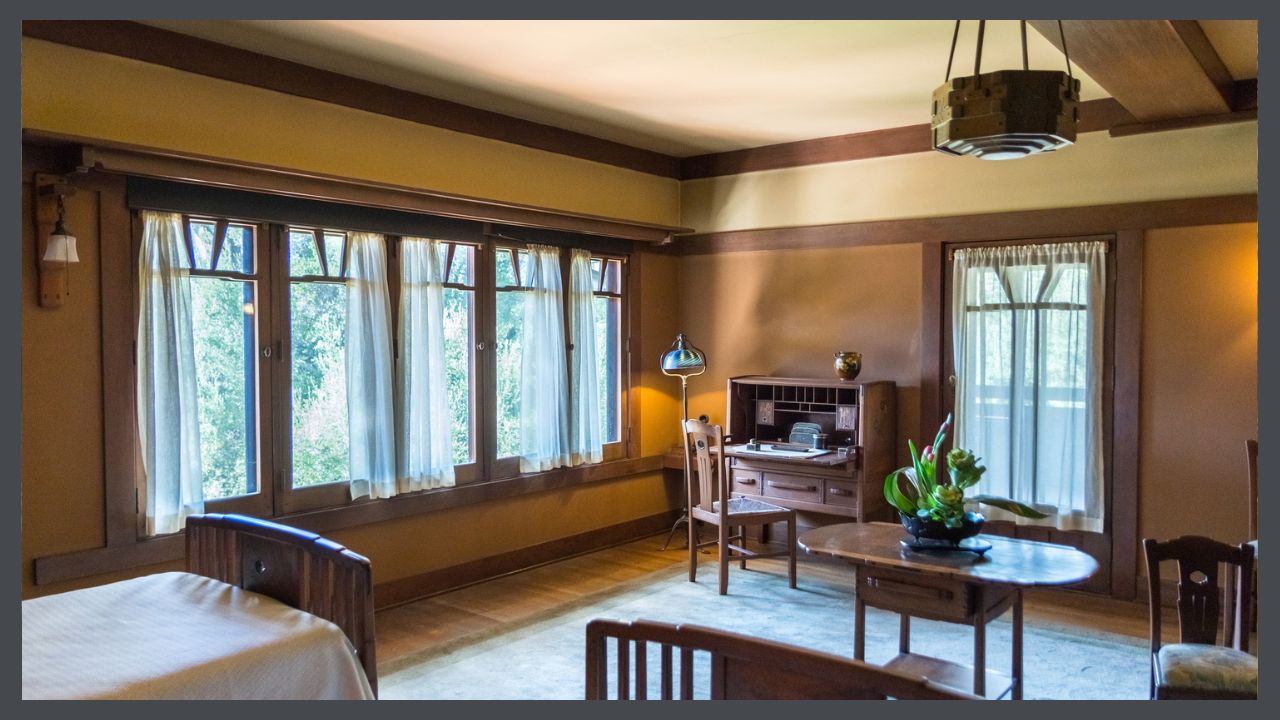
I am a big believer in using family heirlooms & sometimes you will find that your grandmother’s China cabinet, or your favorite whatever is just too big for the room. I encourage you to figure it out. I moved my cherished 100 year old Chinese kitchen cabinet (With its carved cloud lift motif, it is very Greene & Greene!) around my new house for days after downsizing 400+ square feet. In desperation I angled it on 2 walls, added ornamentation on the top, flopped an obi over it that hangs down about 4 feet on each side, & a piece of a camel bridle (believe it or not!) to draw the eye vertically. This shrank the cabinet horizontally & now this oversize piece works visually in my undersize dining room even though you have to scoot around it a tad to walk through the room.
Older houses tend to have higher ceilings. You can take advantage of this by using taller pieces & placing ornamentation on top of them, as I did with my Chinese cabinet.
Just don’t make your living room so dang perfect that it looks like a hotel room or a museum! Make it your own.
Trot on over to Part 5, the almost final decorating article.
 STAY IN THE BUNGALOW KNOW!!!
Sign up for our newsletter & receive our FREE E-book, 7 VITAL Things to Do Before You Hire a Contractor.
by bungalow101 | Jun 10, 2023 | Other areas
MORE ON BUNGALOW STYLE INTERIOR DESIGN
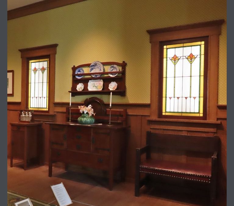
 We have come to the second lesson about the principles of creating visual harmony in design. The elements of design are the puzzle pieces of design & the way that you fit them together, to decorate in the Craftsman style, is found in the principles. These bungalow style interior design tips are the basics of all good design & if applied, will assist you in creating the home that you want. Perhaps you will never have a Stickley dining room like the one at the American Arts & Crafts Museum in St. Petersburg, Florida, but by learning about Arts & Crafts design you will become more confident & satisfied in putting together your home.
I suggest that you should read the articles leading up to this one. They cover the basic elements of design which you will use in the principles written about here & #4 is about the other principles.
Here is the second half of the 7 principles of interior design: unity, balance, rhythm, emphasis, scale & proportion, contrast, & details, which you can use in any home or even to commercial spaces. Let’s see how you can apply them.
USING BALANCE IN BUNGALOW STYLE INTERIOR DESIGN
 Here we come to the concept of visual weight. Visual weight refers to the degree to which an object draws the eye, which is determined by its size, color and shape. You walk into a room & there’s a mouse & an elephant. Your attention immediately goes to the elephant because of its enormous size. You see 2 squares & one is pale blue & the other bright red. Your attention is instantly on the red. Objects with a regular shape, such as a square or a circle, appear heavier than objects with an irregular shape, such as a paisley, a tear-drop shape with a curled end. The irregularity gives the impression that mass or weight has been removed from a regular shape.
Balance is defined as a condition in which different elements are equal or in the correct proportions & create a feeling of stability. Nobody ever looked at a picture of the Titanic sinking & felt anything but terrible.
There are three ways to achieve visual balance & most homes contain a combination of the different types.
Symmetry
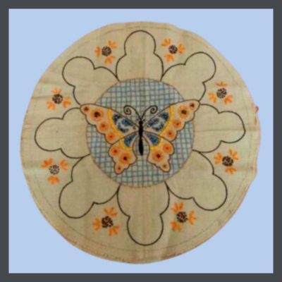 Symmetry is achieved by positioning items evenly along a central axis. It creates a sense of stability, calmness & formality. Mimicking nature- leaves, snowflakes, bodies- this type of balance is often used in A&C design. A good example of this is William Morris’ designs.
Symmetry occurs when each side is a mirror of the other, dividing the space into 2 even parts. This is a formal, orderly look & is used often in Arts & Crafts.
Over the decades, life & design have become more casual. At the beginning of the last century, women wore dresses, men wore ties, & formal symmetry was the order of the day. Additionally, the Arts & Crafts Movement, both philosophically & aesthetically, is based on nature, in which there is often great symmetry.
Asymmetry
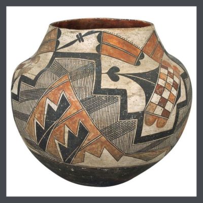 Asymmetry is achieved by positioning an uneven number of things along the central axis. The feeling created by this is more modern, with a greater sense of motion.
This native American pot is a wonderful example of asymmetry. Through the use of pattern & color, it creates a visual balance on all sides. Mid-Century is also a good example of the frequent use of asymmetry.
An asymmetrical design is a looser approach. You still strive for visual balance, but without using mirror imagery. Perhaps your couch would be balanced by 2 chairs that would be positioned across from it. Or you might place a large, “heavier” piece of pottery on one side of your mantle & a couple of “lighter” ones on the other.
Radial Balance
Radial balance is formed by placing elements around a circular center core. A dining table with a round fixture, surrounded by chairs is a good example of this. This is is a formal look & often found in Craftsman design.
At the other end of the spectrum is radial balance. This more intricate approach requires establishing a natural focal point and having other smaller pieces diverge from it evenly. A fireplace could be the example of the focal point in question, and then you could carefully arrange other items facing toward it, for example.
RHYTHM
The fetus hears her mother’s heart, the steady pulse of life & once outside the womb, is comforted by lying on her mother’s breast.
Rhythm, a part of every aspect of life, carries us forward in time. In design, it moves the eye from one point to the next, in a pattern of steady repetition, or a sudden change in pattern, creating contrast or focus.
This heard of elephants thunders across the wall in this tile made by Grueby Faience Company in 1900. I have never seen/heard/felt a herd of elephants moving across the plain up close & personal, but I have seen & heard it in films & the rhythm was powerful!
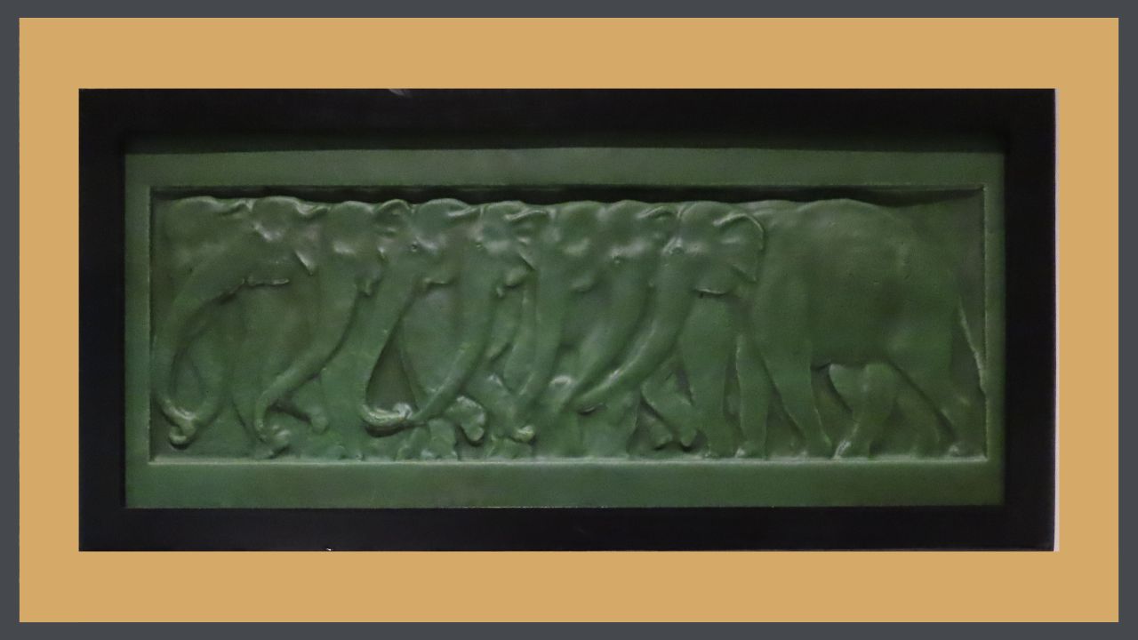
The Arts & Crafts message is one of the natural world, with its gentle (& not so gentle!) rhythm & its subtle variations. This visual rhythm can be created by repeating colors, materials, textures & shapes at varying intervals. Or a frieze of thundering elephants!
The interior features of your house form a basis for this repetition with your wood built-ins & trim. You can provide a contrasting pattern with your textiles, art & other accessories to decorate in the Craftsman style.
HOW TO EMPLOY CONTRAST IN BUNGALOW STYLE INTERIOR DESIGN
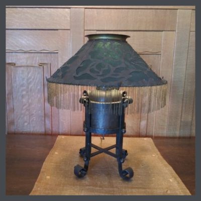 This leads us to contrast, sudden breaks in the rhythm. Linen curtains against the dark of the window frame, pillows on the dark upholstery, creamy slag glass in the lamps on the tables, even the glow of the logs burning in the fireplace, below the dark mantel form a contrast against your dark wood trim.
The Arts & Crafts aesthetic is on the subtle side, like Mother Nature herself. For example, in this lamp, there are many contrasts, but you have to look for them.
There’s an interesting combination of straight & curved lines that define the piece. In the shade, you see curved, organic cut-outs, but the shade itself is almost a perfect triangle. The straight vertical legs come down into cute little curled feet. Even its shape is rather contradictory. It is both a rolly-poly elf, but is also elongated & moves your eye vertically. The oat colored runner on which it sits provides great contrast to the allover dark appearance of the lamp, as well as the wood wall behind it & the table on which it sits. Then what’s with the fringe on the shade? To me, it is a totally incongruous piece of frou-frou, but it works. I find it charming!
EMPHASIS

The word is defined by Oxford as “special importance, value, or prominence given to something.”
When you enter a space for the first time, it is the focal point that orients you to all the other elements. This Is where at the eye naturally comes to a halt, & you visually align the whole room to that point. In many bungalows, the focal points are provided by the architecture: your fireplace with its art tile surround, a beautiful built-in sideboard in the dining room, a sweet little inglenook, leaded glass windows. (All features found only in quezillion dollar homes today, by the way!)
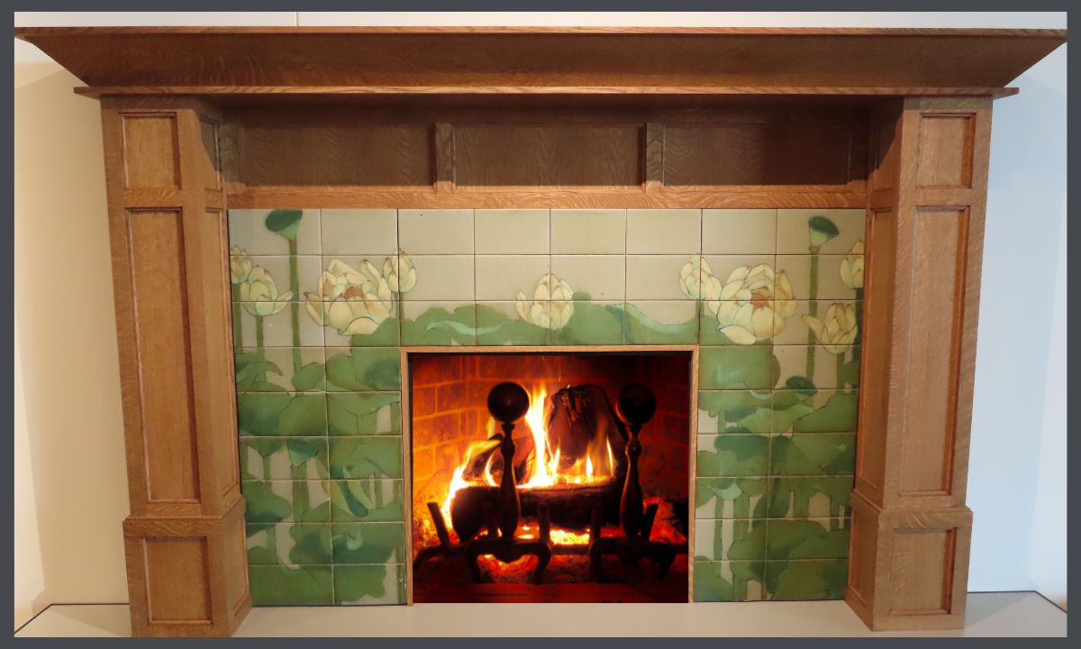
Emphasis can be achieved by using line to point at a feature, contrast, negative space, color, light or a change in rhythm. A fireplace like this one would certainly do the trick!
USING DETAIL IN BUNGALOW STYLE INTERIOR DESIGN
While your furniture will help set the tone, it’s the details that will set your bungalow apart. There are so many wonderful choices in textiles, lighting, pottery, metalwork & art that you can fully express yourself while conveying the Arts & Crafts message.

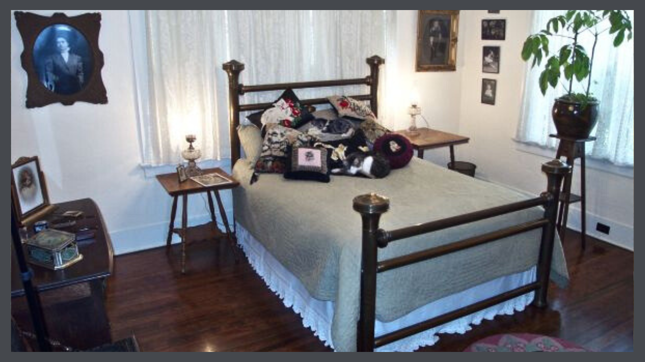
This room in the Hare House, appears in Jane Powell’s book, BUNGALOW: THE ULTIMATE ARTS & CRAFTS HOME despite the fact that yeah, it’s Victorian. However, Linda & I squawked loudly about the fact that not every bungalow buyer trotted out to buy new furniture for their house. It just wasn’t practical. The man who built my house, Reverend Alfred Hare, was known as a good businessman & helped several congregations pay off the mortgages on their church buildings. Throughout the house you see where he chose to spend & where he chose to scrimp. I can guarantee his expenditures did not include new furnishings for the private areas. This argument impressed Jane who was always a sucker for a good backstory & the bedroom appears on Page 238 in all its glory. You can even see the image of my 3 year old mama on the dresser.
So, here, to the left of the bed, you see my grandmother as a young woman. She probably commissioned this portrait with the first money she made as a teacher. One the other side is my husband’s grandfather as a child. I wish the colored, hand-painted background could be seen. On the front wall, photos of my mother-in-law as a child in the 20’s. On my dresser sits my grandmother’s tin candy box which holds her embroidered hankies, & if you look very carefully, you can see her dresser set. The portrait is of my favorite uncle. The lamps beside the bed are oil lamps that my mother had wired for electricity. And on the bed, my kitty pillow collection. Of course the best part of the room is my dear kit, Buhkai, the Big- hearted bungalow kitty. You can read his story here!
As I did, you can express your preferences & tell your story in all of these choices. At the same time, you can honor the history & philosophical underpinnings of your bungalow, the trees who gave their lives for its lumber, the architect who designed it, the craftsman who built it & the people who lived their lives & built your neighborhood & your town, all there, before you were even born.
I’m sure it’s a heck of a story!
Make sure that you begin at the beginning to learn everything you can from this series.
 STAY IN THE BUNGALOW KNOW!!!
Sign up for our newsletter & receive our FREE E-book, 7 VITAL Things to Do Before You Hire a Contractor.

 Gustav Stickley brought Arts & Crafts to America from Europe in the early 1900’s. He carried with him both the aesthetic & the philosophy of the Movement, & then did it his way, inspired by the simplicity of the log cabin. He was considered to be the leading authority on architecture, gardens & interior design for the Craftsman house. Should you wish to learn more about Stickley, check out these videos that I have collected about him & his work.
 Most folks think that the articles in The Craftsman were written by Stickley. Not so. He was a businessman with a large operation to oversee so he employed talented people to create his products & his P.R.
 In all that concerns household furnishings & decoration, present tendencies are toward a simplicity unknown in the past. The form of any object is made to express the structural idea directly, frankly, often almost ‘with baldness. The materials employed are chosen no longer solely for their intrinsic ‘value, but with a great consideration for their potential beauty. The qualities thus apprehended are traced to their source & then carefully developed by the skill of the craftsman.
 We are, first of all, met by plain shapes which not only declare, but emphasize their purpose. Our eyes rest on materials which, gathered from the forests, along the streams, & from other sources familiar to us, are, for that reason, interesting & eloquent. We may, in the arms of our reading-chair, or in the desk before which we pass our working-day, study the sinking undulations in the grain of oak, ash, elm, or other of our native woods, & in so doing, learn the worth of patient, well-directed & skilled labor; of that labor which educates; that is: leads out & develops the hidden Values & qualities of things too often neglected because they are frequently seen.
 STAY IN THE BUNGALOW KNOW!!!


 Here you stand, in your new, empty house. Perhaps you were fortunate to buy a house that needed little restoration, or perhaps you’ve been working for months to rescue it from a tragic combination of remuddling & neglect. And now the paint is dry, the floors are gleaming & the windows slide up & down.
 Most of my friends are very house proud- artists, interior designers, architects, bent on creating magazine-worthy homes & they have the skills to accomplish this.
 After you have answered these questions, read my article on Jane Powell’s book,
 What is interior design? It is a combination of art, science & technology that is employed to enhance the quality of our lives. It is also about understanding how people operate in a space in order to make it functional. In this article, we’re going to look at the elements of basic design for a Craftsman house interior
 Negative space is the area around & between objects, what we usually think of when we say space. It allows our eyes to pause & to see objects individually. With the use of negative space, the eye gets a rest.
 Positive space is the areas defined by objects- architectural details, furniture, textiles, artwork, lighting. The areas are where you want to direct the eye. Which objects you choose & how you place them will determine how the space will feel. Here you can employ all the rest of the elements- form, color, light & texture- to create a mood, tell your story, & enhance the existing features of your bungalow, as well as creating a space that will serve you & your family well.
 Using the correct balance of positive & negative space will help you achieve the look that you want. Like the yin & yang of ancient Chinese philosophy, positive & negative spaces are opposite but complement or complete one another & interrelate to form a whole.
 Light is a vital aspect of any space. A key characteristic of bungalows is that they tend to be on the dark side. Their shady porches & deep overhangs made them bearable before air-conditioning & their dark wood can feel oppressive prompting people to pull out the paintbrush. (Put it down, please.) Once against, contrast creates interest here & the correct use of color & lighting will make your house more livable & lovely.
 INTERIOR DESIGN FOR A CRAFTSMAN HOUSE -More Elements
 Dynamic lines create a feeling of energy & movement. These lines are found most often in the arts & crafts of the Movement, in the portrayal of nature. Pottery, textiles & metalwork feature provide a flowing contrast to the often bulky feel of furniture typical to the period. The juxtaposition of these elements with the horizontal lines of the furniture create interest in a room.
 A home is an intimate space & tactile sensation, interpreted through the skin & the eyes is a key element in design.
 Colors are very powerful in setting tone & influencing mood in the interior design for a Craftsman house. You spend a great deal of time in your home & I think that you might need to review
 My art training consisted of growing up in museums, exposing me to beautiful objects, exquisitely displayed, ballet with its delightful costumery & stage sets, the arts & crafts of the native Americans of the southwest, & the example set by my mother, who had impeccable taste. From a young age, I appreciated beauty but I never had an aptitude for drawing or painting so I never studied art. My taste was formed by what I saw & what my mother taught me. I grew up learning how to decorate in Craftsman style just by osmosis & later, my bungalows were much admired, with 2 of them being featured in books & magazines & on home tours.
 I’m a fan of textiles & encourage the use of simple or low contrast patterns in a smaller bungalow, or room. The Arts & Crafts palette tends to be more muted so it’s a good choice for a house with a reduced square footage, but I still recommend using a more restrained hand in a mini-bungalow. This William Morris pattern, with its muted, pale colors will create a feeling of softness rather than harshly stopping the eye, & would be a good addition to the decor of a smaller space.


 We have come to the second lesson about the principles of creating visual harmony in design. The elements of design are the puzzle pieces of design & the way that you fit them together, to decorate in the Craftsman style, is found in the principles. These bungalow style interior design tips are the basics of all good design & if applied, will assist you in creating the home that you want. Perhaps you will never have a Stickley dining room like the one at the American Arts & Crafts Museum in St. Petersburg, Florida, but by learning about Arts & Crafts design you will become more confident & satisfied in putting together your home.
 Here we come to the concept of visual weight. Visual weight refers to the degree to which an object draws the eye, which is determined by its size, color and shape. You walk into a room & there’s a mouse & an elephant. Your attention immediately goes to the elephant because of its enormous size. You see 2 squares & one is pale blue & the other bright red. Your attention is instantly on the red. Objects with a regular shape, such as a square or a circle, appear heavier than objects with an irregular shape, such as a paisley, a tear-drop shape with a curled end. The irregularity gives the impression that mass or weight has been removed from a regular shape.
 Symmetry is achieved by positioning items evenly along a central axis. It creates a sense of stability, calmness & formality. Mimicking nature- leaves, snowflakes, bodies- this type of balance is often used in A&C design. A good example of this is William Morris’ designs.
 Asymmetry is achieved by positioning an uneven number of things along the central axis. The feeling created by this is more modern, with a greater sense of motion.
 This leads us to contrast, sudden breaks in the rhythm. Linen curtains against the dark of the window frame, pillows on the dark upholstery, creamy slag glass in the lamps on the tables, even the glow of the logs burning in the fireplace, below the dark mantel form a contrast against your dark wood trim.