by bungalow101 | May 25, 2022 | Paint
THE COLOR LESSON
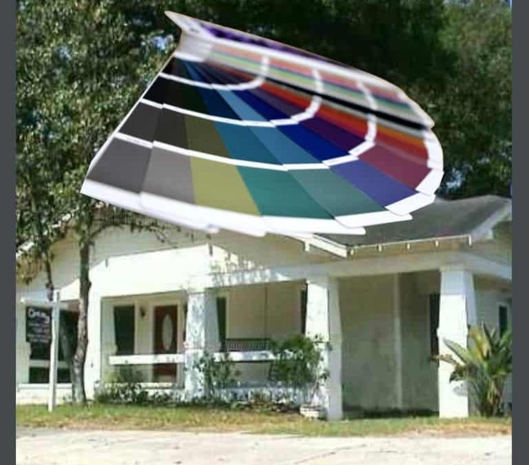
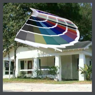
 This is a lesson in choosing the right bungalow paint colors, which can be a huge challenge. Most articles give you a few examples, & the paint manufactureres provide pitifully few Arts & Crafts combinations, but they don’t actually teach you anything about the design history of bungalows or about the use of color to best enhance your home. If you want to learn the how & the why of color choices, stick around & read my series of articles, & then you’ll be able to figure it out for yourself & have a custom color scheme, based on your favorite colors, that you will love.
Read in the order they are presented. Each one builds upon the ones previous.
I’m going to start the choosing bungalow colors lesson with some basic terms, so basic that some of you may know them, but have patience, gentle readers, some may not. If you run into a term in a definition that you don’t know, look for it on the list. If it’s not there, let me know so that I can add it. In this lesson, the list is in teaching order, with images, so that the concepts build, one to the next. You can use this list of terms as a glossary in the next articles that will cover more complex colors, explain the Arts & Crafts palette & the final ones that help you choose colors for your own bungalow.
CHOOSING BUNGALOW COLORS- THE BUILDING BLOCKS LESSON
Color
A quality of an object which is caused due to the light being reflected by this object.
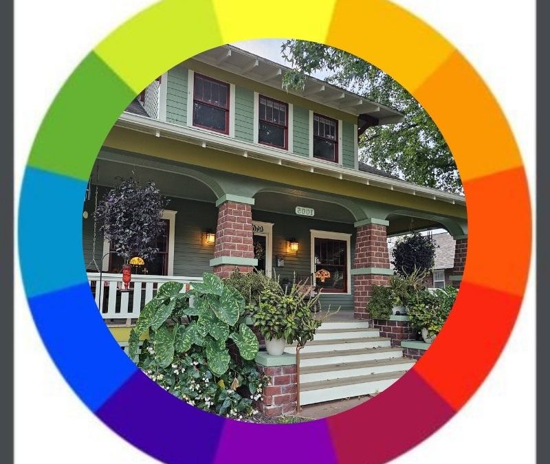
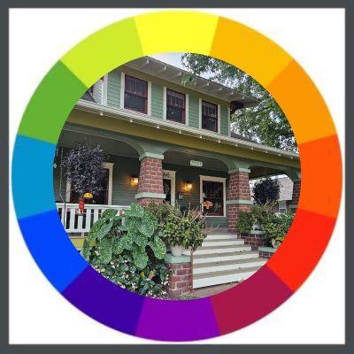
Color wheel
A tool that shows every color in the full range of colors, by gradients.
Hue
A true color with no white, grey or black added.
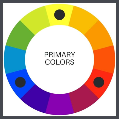
Primary Colors
The building blocks of color- red, yellow, blue. These colors & are cheerful & great for kids’ toys.
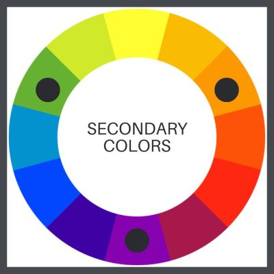
Secondary Colors
Combining 2 primary colors in equal amounts gives you green, orange, violet.
Tertiary Colors
Combining different amounts of the 2 primary colors- gives you red-orange, red-violet, yellow-orange, yellow-green, blue-violet, blue-green. I love this combination of hippy colors!
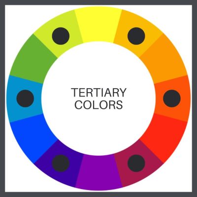
Remember that at the turn of the last century, they were still using natural materials as tints, so these plastic colors would not have even been possible to create. But, the wheel of the day would have still included a variation of these tones.
You can go on to mix tertiary colors to achieve different colors. The closer that different colors you mix together are on the color wheel, the more compatible they are, and the more intense the resulting color will be when the colors are mixed. The further they are, the more muted & less intense the resulting color will be.
CHOOSING BUNGALOW COLORS-THE COLOR GROUPS LESSON
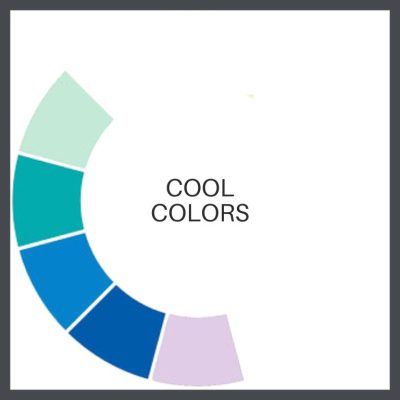
Cool/Water Colors
Do not include any red. Cool colors do include green, blue, & purple, & variations of those three colors. Blue is the only primary color within the cool spectrum. Greens can take on some of the attributes of yellow & still remain cool. Purple takes on some of the attributes of red & still remain warm. As pastels, they can be more subdued than warm colors, but can be more vivid in the jewel tones.
Cool colors tend to be soothing & calming, like a trickling brook.
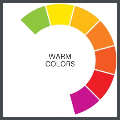
Warm/Fire Colors
Do not include any blue. Warm colors are of orange, red, yellow, & combinations of these. They tend to make you think of warm things, such as sunlight, fire, heat & friendliness.
Visually, warm colors look as though they come closer, or advance which is why they’re often used to make large rooms feel smaller & cozier. They are exciting & their use might raise your blood pressure a little!
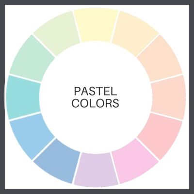
Pastels
These are colors which have white added to them. They can be primary, secondary or tertiary. Happy Easter!
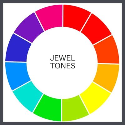
Jewel Tones
Any deep or vivid color suggestive of that of a gemstone; ruby, emerald, sapphire, amethyst, etc. I have actually seen bungalows painted in these wild colors. I live in Florida & I don’t mind them on a Key West style house. In Key West.
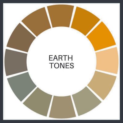
Earth Tones
A group of colors that contain brown, the color of earth or soil. In its larger sense, (& how it will be used here) is colors that are found in nature- soil, grass, trees, berries, flowers, clouds, the sun.
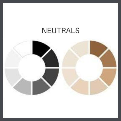
Neutral Colors
Colors that are not found on the color wheel such as gray, beige and brown. Neutral colors are muted shades that appear to lack color but often have underlying hues that change with different lighting. The lighter ones can reflect the colors around them. Though not on the color wheel, they complement primary & secondary colors.
Neutral colors can be complex in tone, as mixing different colors creates unique shades. For example, greige is a mix of light gray and beige, with yellow hues in natural light and gray in fluorescent lighting. (Natural light refers to lighting generated from a natural source like the sun.)
I do not mind an all-neutral palette for a bungalow, but landscaping must be planned to liven it up a little, without overwhelming, & make it look more an extension of nature.
A key issue in color is paint quality.I always recommend Ben Moore because their paints are easy to apply & long lasting. Their colors are well formulated so they are clear & vibrant. They have a great website so that you can search & try colors on a photo of your house, & their customer service is some of the finest in the land.
We are getting closer, but there are still more things to consider before we’re fully submerged in the Arts & Crafts palette.
KEEP READING!
 Part 2, COLOR HARMONY
Combining colors to please the eye.
Part 3, THE ARTS & CRAFTS MESSAGE
The philosophy behind the beauty.
Part 4, OLD BUNGALOW COLORS
Color choices when our houses were constructed.
Part 5, WHAT ABOUT PAINT COLORS FOR YOUR HOUSE?
How to use everything you know about color to pick your dream colors.
Part 6, PAINTING YOUR BUNGALOW EXTERIOR CHECKLIST
Making the big choices.
Part 7, IT’S ALL ABOUT THE CHEMISTRY- LEAD PAINT IN BUNGALOWS
Because I think I’m everybody’s mama.
 STAY IN THE BUNGALOW KNOW!!!
Sign up for our newsletter & receive our FREE E-book, 7 VITAL Things to Do Before You Hire a Contractor.
by bungalow101 | May 24, 2022 | Paint
COLOR HARMONY
 HARMONY DEFINED: The degree of harmony is determined by how well the separate parts of a piece of art work together, & have some sort of logical progression in their relationship.
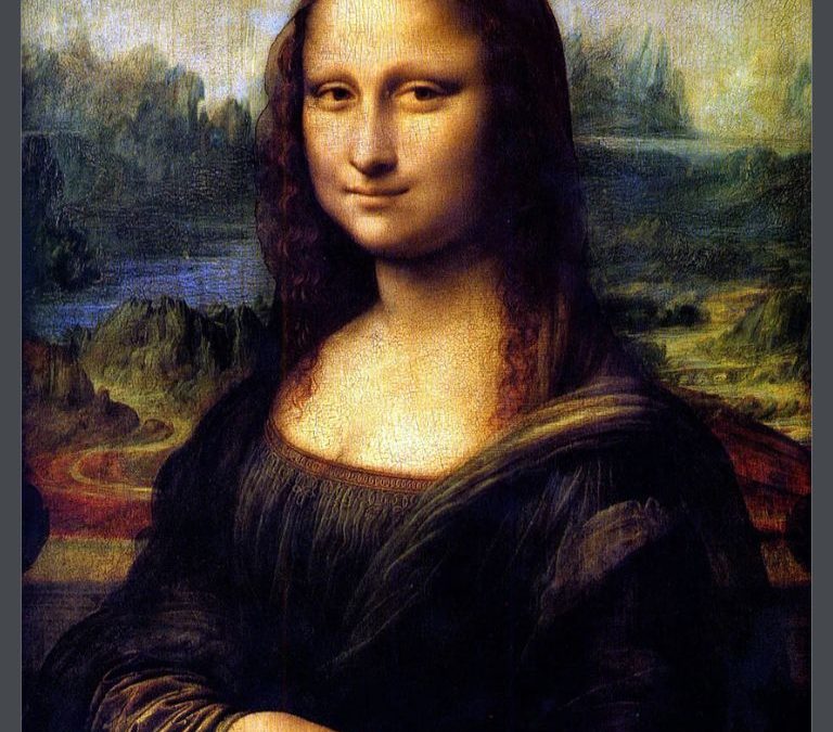
Not just a concept used in music, harmony forms the basis of any visual design in which pleasing color relationships are used to convey a message & create a particular look or feel. We will look at the message of the Arts & Crafts philosophy in Part 3, but for now let’s just concentrate on pleasing color arrangements. Gazing at the Mona Lisa, I am drawn into her beauty & serenity. A great deal of this is created by the colors that are used for the figure & the natural background.
We’re going to assume that you are going to choose to employ several hues, probably 3-ish, on your bungalow because it is traditional to use different colors to point out the different materials- stone, wood, concrete, or elements such as windows, window frames, door, columns, siding etc.
Eye-pleasing combinations are based on different geometric relationships on the color wheel. They can be moved around the color wheel to get different combinations. Let’s look at them.
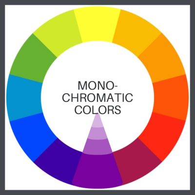
Monochromatic
A color scheme using one color or several colors close to it. This color combination can be very soothing and calming. Maybe not in purple!
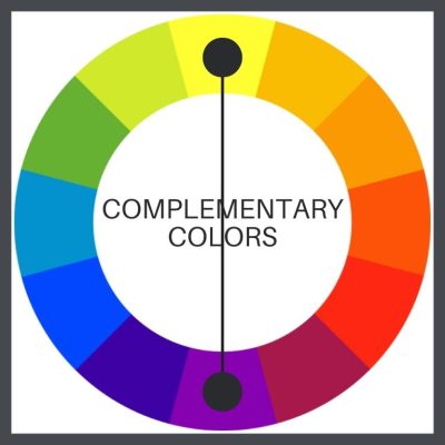
Complementary
Two colors that are opposite each other on the color wheel (example: red and green.) Complementaries can make each other appear brighter. Green next to red makes the red look “redder” & vice versa.
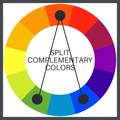
Split complementary
A split-complementary color scheme takes up a primary color & two secondary colors.
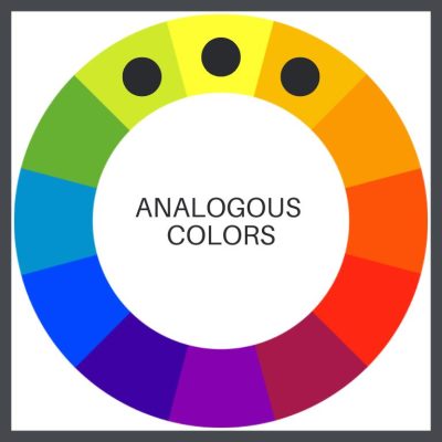
Analogous
Any three colors side-by-side on the color wheel. Analogous colors are often found in nature and can be very pleasing to the eye. Usually, one color is more dominant than the others.
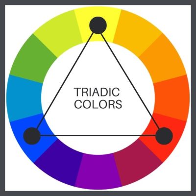
Triadic
Three colors that are equidistant from each other on the color wheel (example: the primary colors, red, yellow and blue.) Think alphabet blocks.
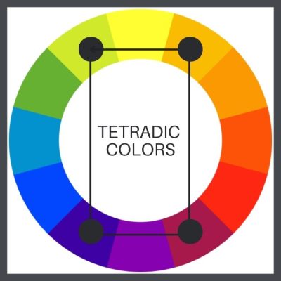
Tetradic
Four colors that form a rectangle from each other on the color wheel. I’m not fond of more than 3 colors on a bungalow. It’s no more appropriate than adding gingerbread to the front gable.
Any of these combinations can be used with any types of color- primary, secondary or tertiary. You can also throw in the variations below. (This is why I want to take you beyond the historic color palettes offered by the paint manufacturers. They are very limiting.)
BUNGALOW COLOR HARMONY- MANIPULATING COLOR
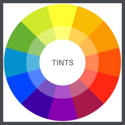
Tints
Adding white to colors.
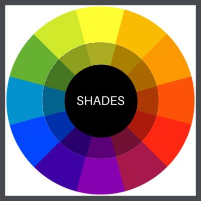
Shades
Adding black to a pure hue.
Tones
Requires adding both black & white. The resulting colors are more natural than shades and tints & pure color.
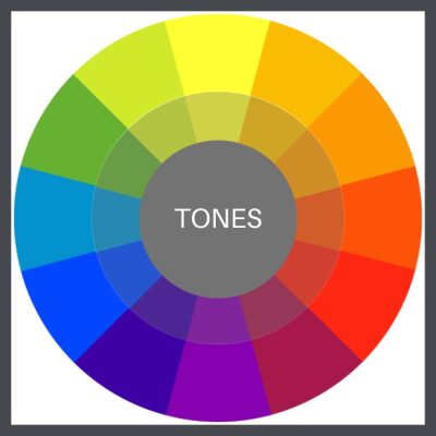
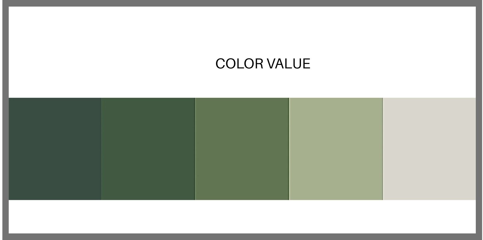
Value
The relative lightness or darkness of a color, which is held constant. A paint color sample strip, showing a color from lighter to darker, is a perfect example of changing value.
We are so-o-o-o much closer to looking at actual, historically appropriate colors, but, there’s more! We’re going for the Full Monty of bungalow color.
A FEW MORE BUNGALOW COLOR TERMS
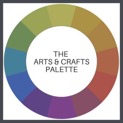
Palette
A particular range, quality, or use of color, resulting in harmony.
Example- the Arts & Crafts palette- the colors used by the artists & craftspeople of the Arts & Crafts Movement.
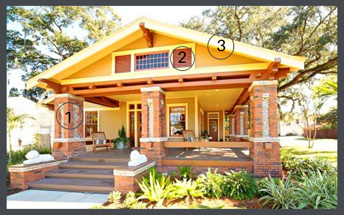
Key color (1 below)
The most important color of your design. It’s the color you can’t change, such as grass or wood or brick or stone, or the color of the element to which you want to draw attention. You need to know your key color before you can determine your color harmony. This will be your starting point.
Accent color (2 below)
One used in comparatively small quantities in a space, to add impact & interest. A classic decor rule that states that 60% of the space/object should be a dominant color, 30% should be the secondary color & the last 10% should be an accent. (70, 20 & 10 work well too.)
You can easily take a perfect combination of colors, & by using them in the wrong proportion, create a gaudy mess.
Contrast (3 below)
The arranging of opposite elements, such as light versus dark. The house shown below is textbook perfect bungalow color harmony.
ONE MORE TIP
Here’s a video that you can view to see all these combinations in action. Please watch it twice, but come back! There’s more!
Before you pick up your keys to head to the paint store, I also suggest that you buy & use the color wheel shown in the video-a great tool that you can just fool around with & learn a huge amouint about color.
KEEP READING!
Part 1, THE COLOR LESSON
How to combine colors on your bungalow to most enhance its features.
Part 3, THE ARTS & CRAFTS MESSAGE
The philosophy behind the beauty.
Part 4, OLD BUNGALOW COLORS
Color choices when our houses were constructed.
Part 5, WHAT ABOUT PAINT COLORS FOR YOUR HOUSE?
How to use everything you know about color to pick your dream colors.
Part 6, PAINTING YOUR BUNGALOW EXTERIOR CHECKLIST
Making the big choices.
Part 7, IT’S ALL ABOUT THE CHEMISTRY- LEAD PAINT IN BUNGALOWS
Because I think I’m everybody’s mama.
STAY IN THE BUNGALOW KNOW!!!
Sign up for our newsletter & receive our FREE E-book, 7 VITAL Things to Do Before You Hire a Contractor.
by bungalow101 | May 23, 2022 | Paint
THE ARTS & CRAFTS MESSAGE
 The Arts & Crafts message is evident in every piece of design that flowed from the masters of the Movement 100 years ago & is passed on by those in today’s Revival.
The motivation & purpose of art is communication, the passing of an idea from one person to another. Going back to the drawings of the early cave dwellers which may have been the works of shamans, illustrating their visions, humankind has used symbols to communicate ideas & emotions & to influence the thoughts & behavior of others, even the gods.
 Who has not been moved to tears by a mournful song or invigorated by a joyful tune? Though we have never met the songwriters or the singers, (Well, I actually did. I was a groupie!) we feel intimately connected with them. We hear them & we respond to them. That communication has an emotion & hearing it changes our own emotions.
We perceive visual images daily, be they advertising, art or our friends’ latest antics on Facebook. It’s all communication- the passing of ideas from one person to another.
THE MESSAGE & CULTURE
 The communication of design both expresses & influences culture. Let’s define culture as the customs, arts, social institutions, technologies & achievements of a particular nation, people, or other social group, at a particular time. They are intertwined & build on one another. The art of a culture expresses that culture & at the same time, the voice of the artist guides the culture.
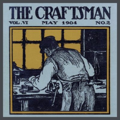
This image conveys woman from the viewpoint of the 1920’s & communicates to them from that viewpoint. It says that she should be on display, with her best leg forward, thin & young, but not too much on display- a man should determine the appropriateness of the length of her beach attire. Nobody is objecting to this demeaning treatment. It’s the reality, the law, of the times. It is further solidified by the image. (Disclaimer- I’m not advocating here for being unhealthy, unattractive nor for parading oneself like a piece of meat. There’s a happy medium here. No pun intended.)
So how does this relate to our good buddy, the bungalow?
THE ARTS & CRAFTS MESSAGE & YOUR BUNGALOW
 What does your bungalow want to say?
Your bungalow’s design sprouted from the Arts & Crafts Movement in England, a reaction to the shoddy quality goods & the disruption of society that came about during the Industrial Revolution. The Movement was founded on a belief in good craftsmanship, which stresses the inherent beauty of the material, the importance of nature as inspiration, & the values of simplicity, utility, & beauty.
In 1889, Gustav Stickley traveled to Europe & brought the philosophy & the design aesthetic to America, created a furniture line & starting a magazine which focused on Arts & Crafts, American style. This dinky paragraph is a hugely glibbed story of the Movement & Stickley’s influence so I urge you to learn more about the Movement. I have curated some amazing videos that will immerse you in the subject, including some about Stickley. Watch them & I promise that you will never look at your bungalow the same way again.
So, your home is most beautiful when the colors you choose reflect the Movement. These colors create a harmony, with one another, with the design & the material elements of your bungalow, & with Mother Earth herself. Let’s take these elements & figure out the best /most harmonious, color scheme for your house. Part 5 is all about houses, (Stay with me here.) but we’re going to look at color theory just a bit more. It is beautifully demonstrated in the pottery of the era/Movement.
ARTS & CRAFTS COLOR THEORY IN ACTION
William Henry Grueby displayed his art pottery in 1897 for the first time in the exhibition of The Society of Arts & Crafts of Boston. The popularity of his work grew quickly because of its simple designs & the beautiful, nature inspired, matte glazes that he had developed. This pottery had little ornamentation other than form because of these the stunning, natural beauty of these glazes, which motivated David Rago, an expert in American art pottery, to write, “a good piece of their work looks more harvested than potted.”
Grueby pottery is a clear voice for the Movement. In every way it expresses:
- A reverence for fine craftsmanship. That feature rings out loud & clear, both from the exquisite design & from the glazes that Grueby worked years to perfect.
- Inherent beauty of the material. The glaze changes the raw look of the bare clay very little, other than adding color.
- As far as being nature inspired, I agree with Rago’s statement that it looks like it was harvested & I’m going to add, “organic, local & fresh!”
No doubt about its simplicity or its beauty.
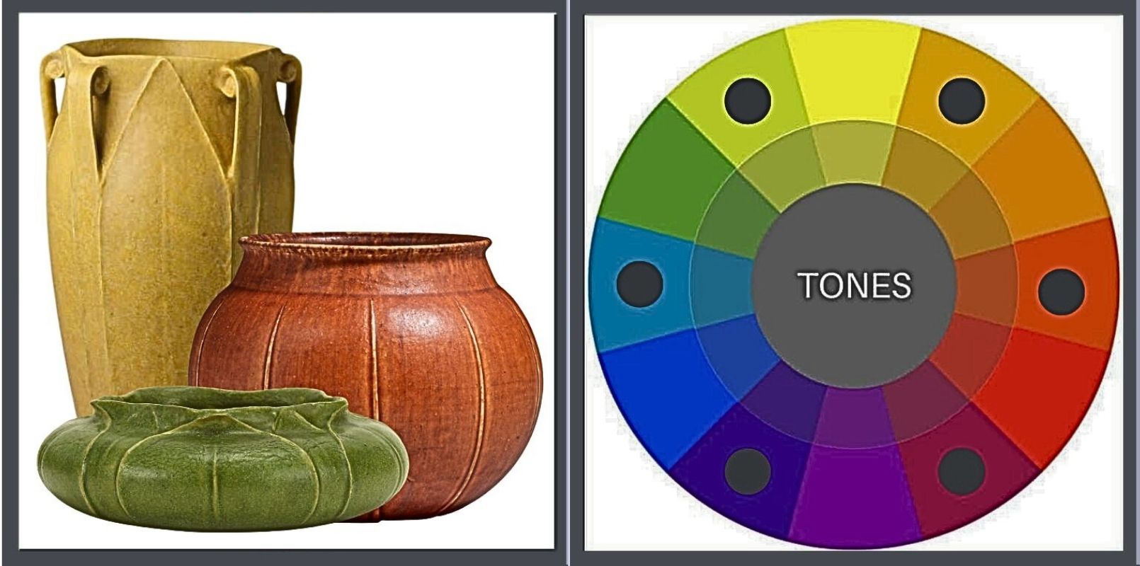
Now, let’s look at their colors. Each piece is a poster child for the colors of Mother Earth, tending to feature tertiary tones. They are not clear primary or secondary tones & are further muted by the addition of black & white.
I’m going to shift over to the more ornamented Newcomb pottery so that we can look at color harmony.
They deliver the same message, from a different, equally harmonious voice. Trend alert! Notice that they too are tertiary colors, toned by black & white.
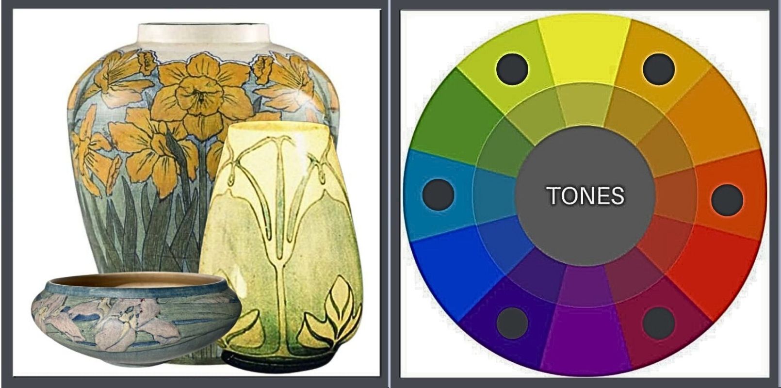
American Arts & Crafts pottery produced from 1895 to 1940, they were thrown by hand (by men) & decorated (by women), each one unique. They were all required to be functional, as dinnerware or vases, but the aesthetic aspects of nature & fine craftsmanship were regarded as highly important. Each piece was formed of local clay & their subject matter reflected the natural world around them. And there is no doubt that they are enchantingly beautiful. I offer them to you as a way to further train your eye.
WHAT ABOUT BLUE?
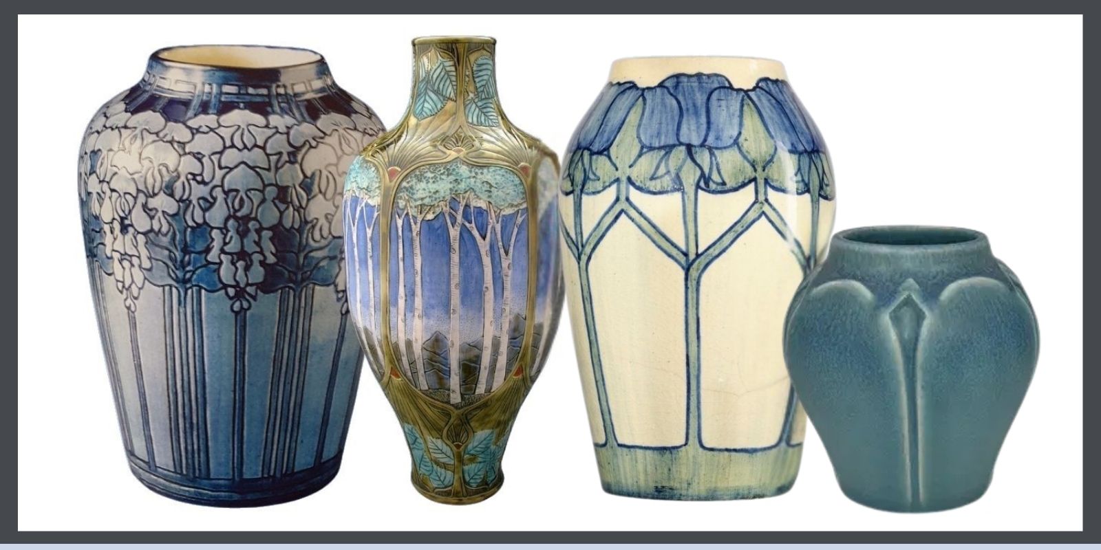
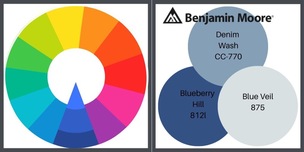
Blue is a found in the A&C palette, as seen in the Seroco palette (Pure Blue.) It is a color often used in pottery. It’s the color of the sky & you’d be hard-pressed to find something more natural than the sky. It complements brick beautifully, as well as off-white & greens & grays.
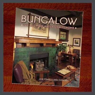
Jane Powell’s BUNGALOW:The Ultimate Arts & Crafts Home (page 70) shows a very cool Gothic Revival in Denver that is painted 2 shades of blue. In my mind’s eye there’s another blue one, I believe in Portland, but I’m failing to locate it. Dang!
I would paint an A&C house blue.
I’M GOING TO GO YOU ONE CRAZIER
“The happiest omen for a New Year is first Mount Fuji, then the falcon, & lastly eggplant.”
-A famous Japanese proverb
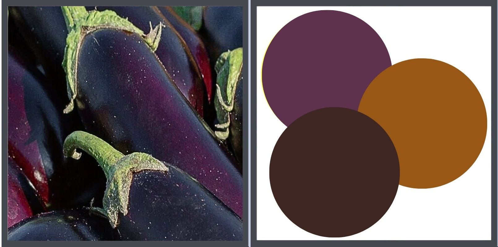
One of my favorite bungalow ACCENT colors is eggplant. Allow me to ‘splain.
Firstly, purple was my favorite color for many years. It was Jane Powell’s favorite color & she drove a purple P.T. Cruiser. (Mine was red.)
Solanum melongena, eggplant, aubergine, bringal (India) is a member of the Nightshade family, Solanaceae. At one time, it was believed to be highly poisonous & indeed, if consumed in large quantities, its flowers & leaves are toxic.
 Jane always felt that anything was permissible with a good backstory. Here’s mine. The colors of the A&C palette were inspired by nature. To be inspired by something, you need to see it, hear it, smell it, etc. However, eggplant was difficult to grow in England. It likes warmer, sunnier climates so its fruit is reluctant to ripen even in warmer areas. Being considered poisonous, why would you waste valuable greenhouse space? So, nobody saw it to be inspired by it because in my heart-of-hearts, I believe they would have been.
But 100 years later, I saw an eggplant & I feel that its color conveys the Arts & Crafts message clearly & beautifully. Combined as an accent, with brown & deep gold, it creates a lovely, natural palette. Have I seen it on any paint cards? No. Do I care? No again, but I’m still looking. I’m thinkin’ Jane might have felt the same way.
SO WHAT DOES THE ARTS & CRAFTS MESSAGE HAVE TO DO WITH MY BUNGALOW’S COLORS?
KEEP READING!
Part 1, THE COLOR LESSON
How to combine colors on your bungalow to most enhance its features.
Part 2, COLOR HARMONY
Combining colors to please the eye.
Part 4, OLD BUNGALOW COLORS
Color choices when our houses were constructed.
Part 5, WHAT ABOUT PAINT COLORS FOR YOUR HOUSE?
How to use everything you know about color to pick your dream colors.
Part 6, PAINTING YOUR BUNGALOW EXTERIOR CHECKLIST
Making the big choices.
Part 7, IT’S ALL ABOUT THE CHEMISTRY- LEAD PAINT IN BUNGALOWS
Because I think I’m everybody’s mama.
STAY IN THE BUNGALOW KNOW!!!
Sign up for our newsletter & receive our FREE E-book, 7 VITAL Things to Do Before You Hire a Contractor.

by bungalow101 | May 21, 2022 | Paint
OLD BUNGALOW COLORS!
 There were many paint companies selling paint at the turn of the century & they all created palettes to reflect the natural colors of the new A&C trend.
Paint had evolved tremendously since early humans mixed natural pigments like charcoal, clay, & iron oxide with binders such as animal fat, blood, or plant sap to create cave art.
Over centuries, paint evolved along with human technology as dwellings became more sophisticated but still required coatings to preserve them & art to make them home. You can learn more about paint chemistry here.
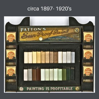
Looking at the history of paint just prior to the time that our bungalows were built, the most impressive developments were created by Henry A. Sherwin and Edward P. Williams who first established The Sherwin-Williams Company. At the time, paint was purchased in its component parts & was mixed onsite by painters, putting a great deal of lead into homes. (Part 7 again) Their company revolutionized the industry with the invention of the first ready-mixed paint in 1875. These guys were serious about paint, & in 1884 the company hired Percy Neyman, the first full-time chemist in the American paint industry, to improve product quality and formulas. In 1877 they patented a resealable paint can, once again keeping harmful chemicals out of the environment.
I am going to skip telling the story of all the innovators at the time because they are well represented in a wonderful Facebook group, 100 Years of Paint Sample Cards. You can see many, many sample cards here from a huge number of manufacturers, & discover many colors that would be bungalow appropriate.
SEARS, ROEBUCK & CO., AMERICA’S PREMIER RETAILER
I am going to talk about 1 manufacturer. We all know about Sears kit houses-prefabricated homes that were delivered by train all ready to assemble on site, but Sears also offered many products as well as their own line of paints, Seroco paints, an abbreviation for Sears, Roebuck & Co. You could purchase alone, or use to make your kit house your very own.
In the early 20th Century Sears was a retail giant & a staple in many homes. Pardon my tangent, but Sears is a lovely part of my own history. As a rite of passage, when I was a pre- teen in the early 60’s, I was dropped off at Sears on Saturday afternoons with a slightly older friend. For the first time, no parents accompanied us! We were free!!! I loved shopping in their clothing department in which a grown-up friend from my ballet school was the Fashion Coordinator for the teen clothing section. I felt very sophisticated to know her & bought most of my clothing there. At the time, Sears clothing was considered to be very fashionable.
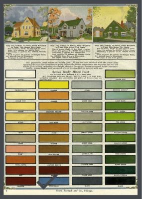
My mother, probably felt safe dropping her wild child off there for several hours because Sears had always been a part of her life. Offering rural mail order from 1886, I’m guessing that Sears provided my great-grandparent’s impoverished farm family with dreams of goods far beyond their reach. My mother often joked about how the catalogue was kept in the farm outhouse with the corncobs, scratchy, but effective, when, as a child she went to visit her grandmother. I have little doubt that my grandmother, busy with 3 children, took advantage of Sears mail delivery to clothe everyone & to obtain goods not available in her small town in West Virginia. Below is a Seroco paint catalogue from 1914. An inside page shows the colors that were offered. In part 5, I go to Seroco paints to demonstrate what I have written about color theory.

WHAT ABOUT PAINT COLORS FOR YOUR HOUSE? KEEP READING!
Part 1, THE COLOR LESSON
How to combine colors on your bungalow to most enhance its features.
Part 2, COLOR HARMONY
Combining colors to please the eye.
Part 3, THE ARTS & CRAFTS MESSAGE
The philosophy behind the beauty.
Part 5, WHAT ABOUT PAINT COLORS FOR YOUR HOUSE?
How to use everything you know about color to pick your dream colors.
Part 6, PAINTING YOUR BUNGALOW EXTERIOR CHECKLIST
Making the big choices.
Part 7, IT’S ALL ABOUT THE CHEMISTRY- LEAD PAINT IN BUNGALOWS
Because I think I’m everybody’s mama.
Now head on over to Part 5. to put together all the information you have learned about color theory, with historic colors from the Seroco line. Adding the modern colors now available from Ben Moore, you will be able to formulate palette choices for your own house.
 STAY IN THE BUNGALOW KNOW!!!
Sign up for our newsletter & receive our FREE E-book, 7 VITAL Things to Do Before You Hire a Contractor.
by bungalow101 | May 20, 2022 | OUTSIDE, Paint
WHAT ABOUT PAINT COLORS FOR YOUR HOUSE?
 Well, we have looked at THE COLORS LESSON in Part 1., which reviews the basics of color theory that we all learned in school. Part 2., COLOR HARMONY, was all about how to combine colors on your bungalow to most enhance its unique features. THE ARTS & CRAFTS MESSAGE, Part 3., was a lesson in the social & design philosophy that originated in England over 100 years ago, & how it applies to color. In the next one, Part 4., LET’S LOOK AT SOME BUNGALOW COLOR, we viewed actual paint color samples of the period.
So what now?
PUTTIN’ ALL THAT BOOK LARNIN’ TO USE
We studied the use of color theory & also color harmony as it applies the Arts & Crafts Movement. Now we’re going to put all that information together & toss in modern day paint colors by Ben Moore, that you can use on your own house. We’ll go from some simple combinations, to more complex harmonies.
What you will see in the images below are the harmonies of the color wheel translated into colors from the Sears Seroco historic palettes. Below on the left is our starting point, the wheel. On the right, are the Ben Moore colors, as translated from the historic colors.
In some cases I have shown the Seroco colors to be more subdued in their BM editions. I prefer palettes that meld with their environments, so the BM & the Seroco don’t always look the same. The BM colors that I have chosen might be more muted, or more toned.
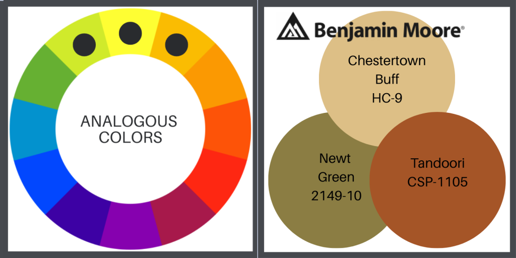
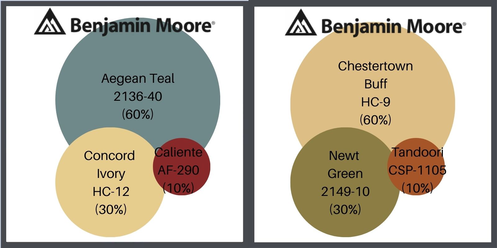
ANALOGOUS PAINT COLORS FOR YOUR HOUSE
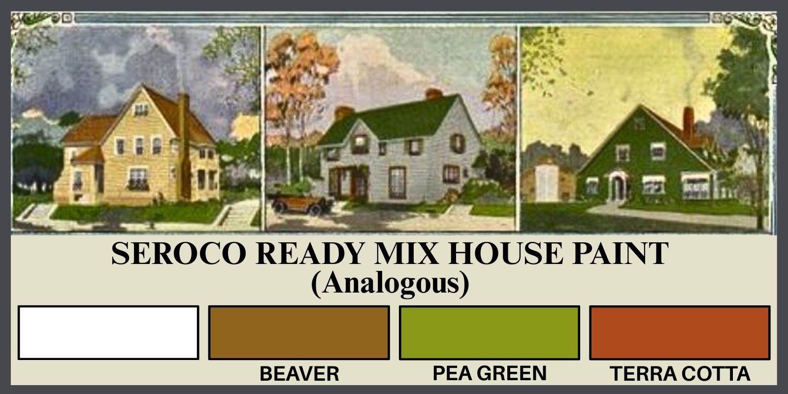
These groups, generally composed of 1 side-by-side, 1 secondary & 1 tertiary color, create a cohesive combination, sharing one another’s tones. They are the color harmony of nature- the cool greens of the forest in one section of the wheel & the warm reds & oranges of the same forest in the fall, on the other side of the wheel. It’s interesting to see what combinations pop up when you slide around the color wheel.
Here is the analogous color wheel, with the same colors from Ben Moore, as translated from Seroco, above.
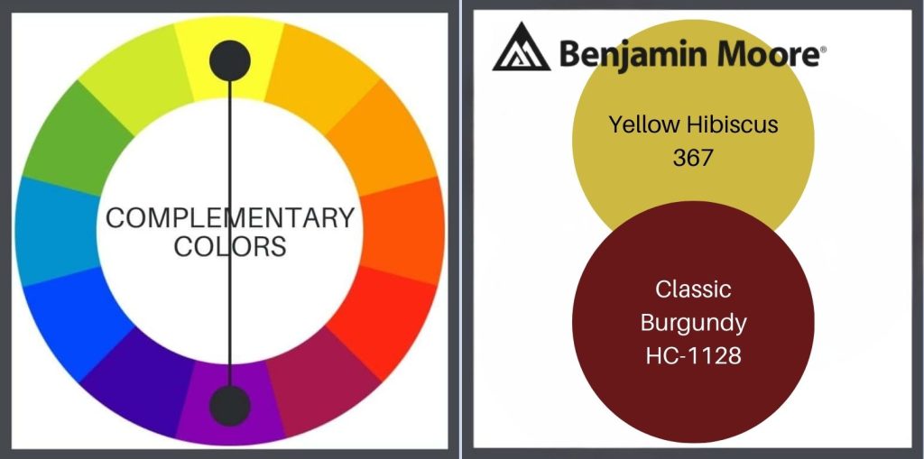
COMPLIMENTARY PAINT COLORS FOR YOUR HOUSE
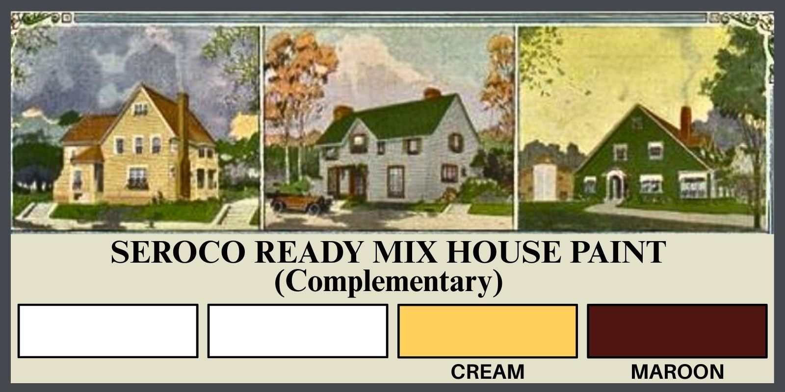
Using 2 contrasting/complimentary colors is a great way to achieve bold color, without creating clutter. This combination simplifies the process & the pallet. It’s also a handy choice when you have another design element such as stone, brick or unfinished wood, that you must include. Below is an example of this harmony choice, again featuring the color wheel on the left & the current, Ben Moore version of the historic color on the right.
By spinning the color wheel, to the right or to the left, & adding black & white in differing amounts to the base color, you can expand these color choices.
MONOCHROMATIC
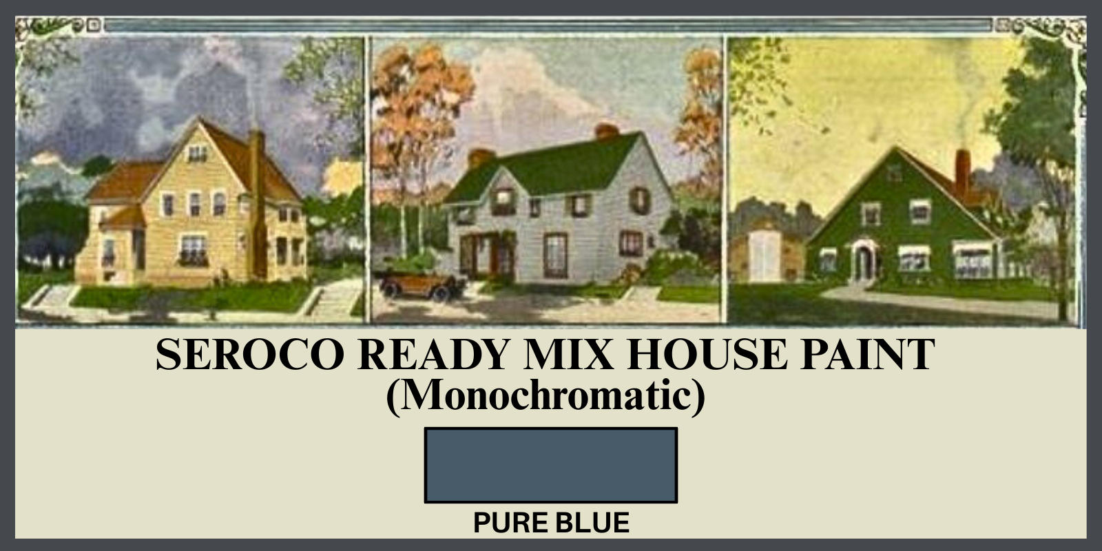
Next is monochromatic color, a base color repeated from light to dark. This can be created by adding more or less white to the base color, but also by adding black or gray. It doesn’t sound very exciting, but you can create a dramatic look by using this palette. Below is Ben Moore’s version.
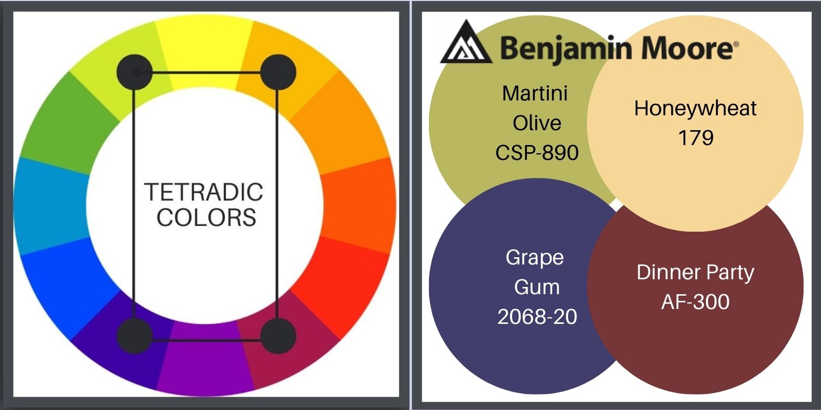
TETRADIC PAINT COLORS FOR YOUR HOUSE
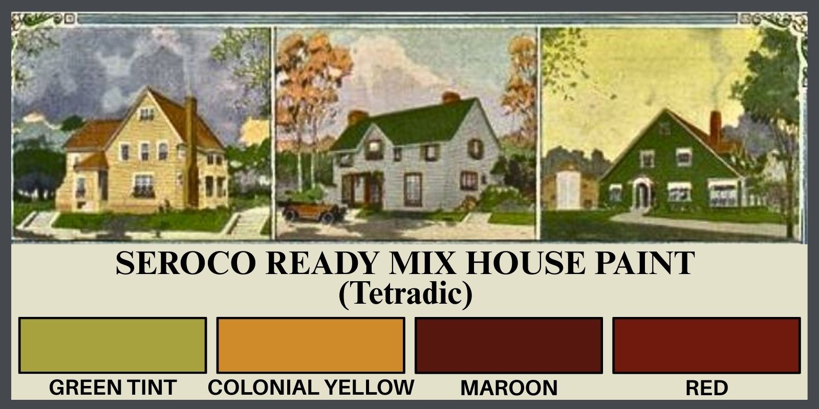
I generally suggest using no more than 3 base colors, because we don’t want to become a fussy Victorian & because using 3 is the most pleasing to the eye. There’s even a rule about it, called simply, The Rule of Three. Now, any group of odd numbers will work, but the simplicity of 3 really nails it, proving a visual that is balanced, relaxed & interesting. It’s just how we are wired.
But, let’s go our own way for a minute, & see what we can do with the 4 colors of the tetradic color wheel. Above is the Soroco historic paint sample sheet, & below is our friend Ben. Seroco didn’t give me much for purple so I fudged. Let me know what you think in the comment section below!
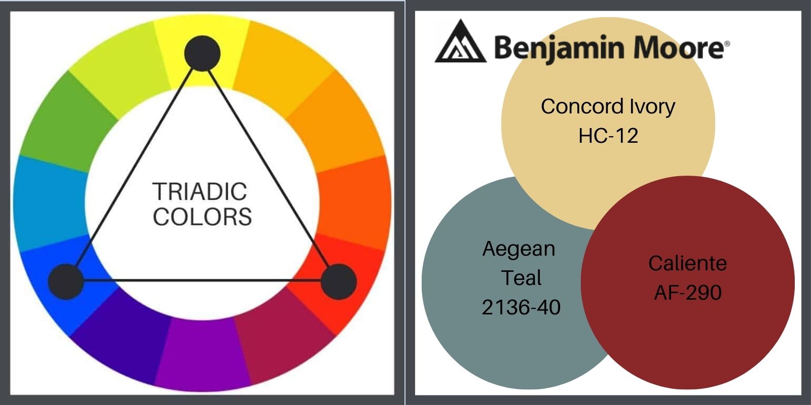
TRIADIC PAINT COLORS FOR YOUR HOUSE
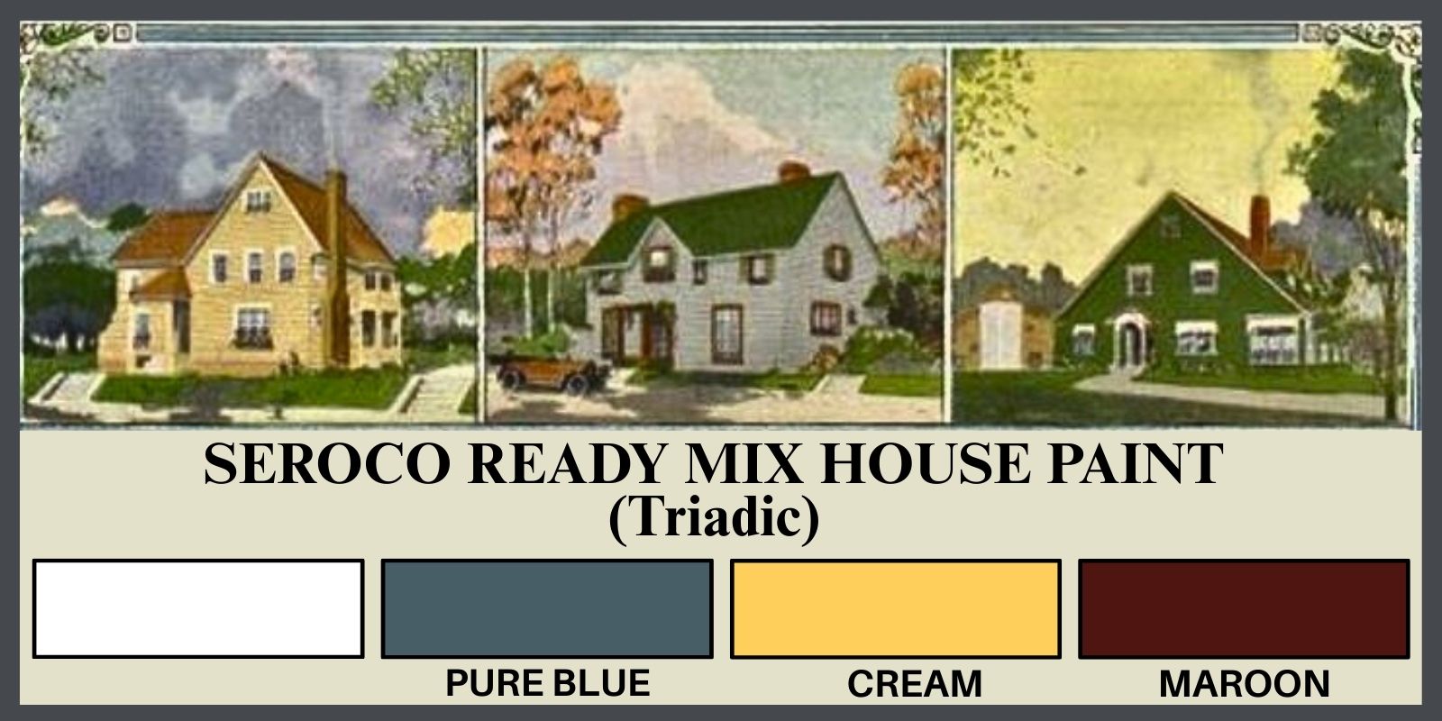
Because this color wheel example displays only primary colors, the Soroco & the resulting Ben Moore choices are quite a bit different from the wheel. While Ben does offer some clear, primary hues, the historic (Soroco) sample tends more tertiary, a la the smaller, more earthy A&C range.
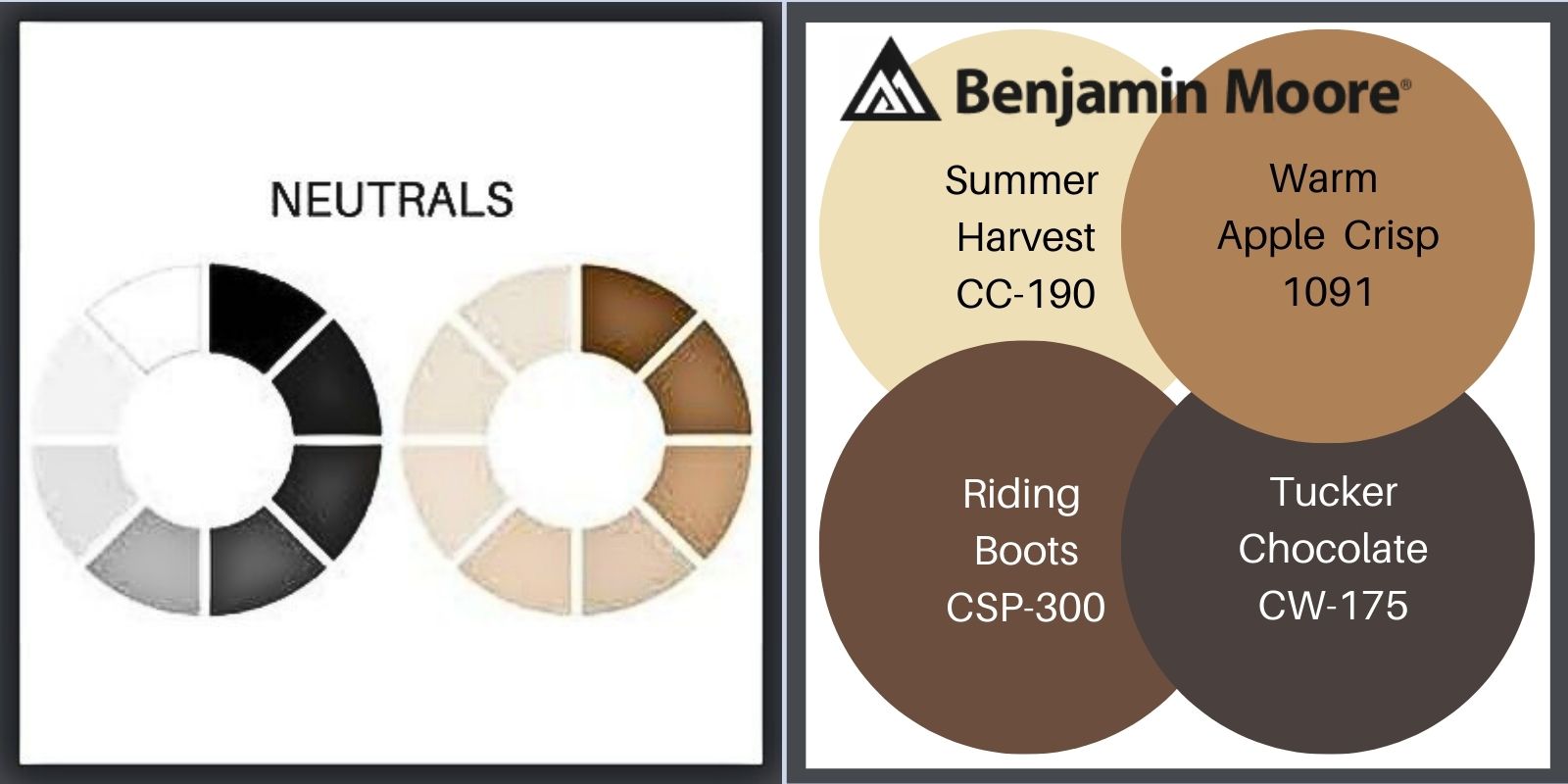
NEUTRAL PAINT COLORS FOR YOUR BUNGALOW

Always sophisticated, this palette is simple but can still surprise as strongly as most any combination of colors. (Notice I said most. I’ve seen some poor bungalows I can describe only as Key West inspired. We’re talkin’ strong! I prefer the lime to be in the pie.) I did not choose to employ the black in the Ben Moore palette. I prefer the little bit softer dark, dark brown.
Of course you can also mix any hues with neutrals. It’s a lovely combination!
THE GREAT DIVIDE
The proportion of area for each color is as important as the choice of colors. Because there is so much color on a home’s exterior, you can easily create an imbalance that will visually distort how your house appears. An imbalance of color will create disharmony & confuse the eye. It wants to know where to focus.
Correct color proportion is 60% dominant, 30% secondary, 10% accent. The dominant color sets the mood. The theme of the Arts & Crafts Movement is nature, but, within that, houses can be more or less formal.
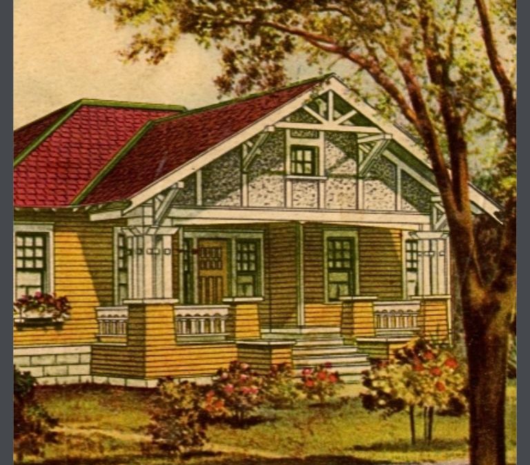
THE HARE HOUSE
The Hare House was shingled & had never been painted. I replaced about 10% of the shingles due to sun damage, then chose a stain color that would receded the house even further back than it sat on its large lot. I had a very large, old pine tree & had planted a stand of birches & I wanted to honor their space. I gave my painter the 3 chips- one stain & 2 paint & sped off to the office. Upon my return, I discovered that he had not used stain, but paint. It broke my heart.

The Hare House was very formal. I chose traditional colors for it- my 60% is a very dark brown, a neutral, to express this.
My secondary, 30% color was a redder brown. The contrast was not huge, but it accentuated the change of material & made it easy to see the detail in the trim.
The green detail (the 10%-ish) on the windows, a nod to the garden was a subtle complimentary color to the red brown. Both the red & green were heavily toned, muddy, tertiary colors, with the red leaning cool & the green leaning warm.
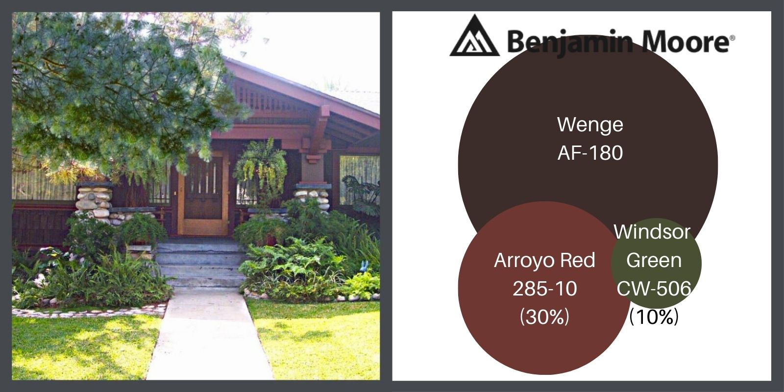
You can fudge with 70%, 20% & 10% if the details of your house necessitates it. This house also shows a good example of of the use of color with a natural element, such as stone.
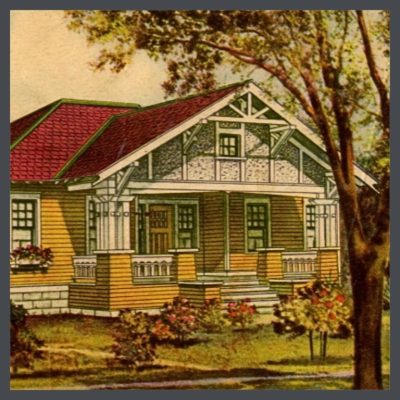
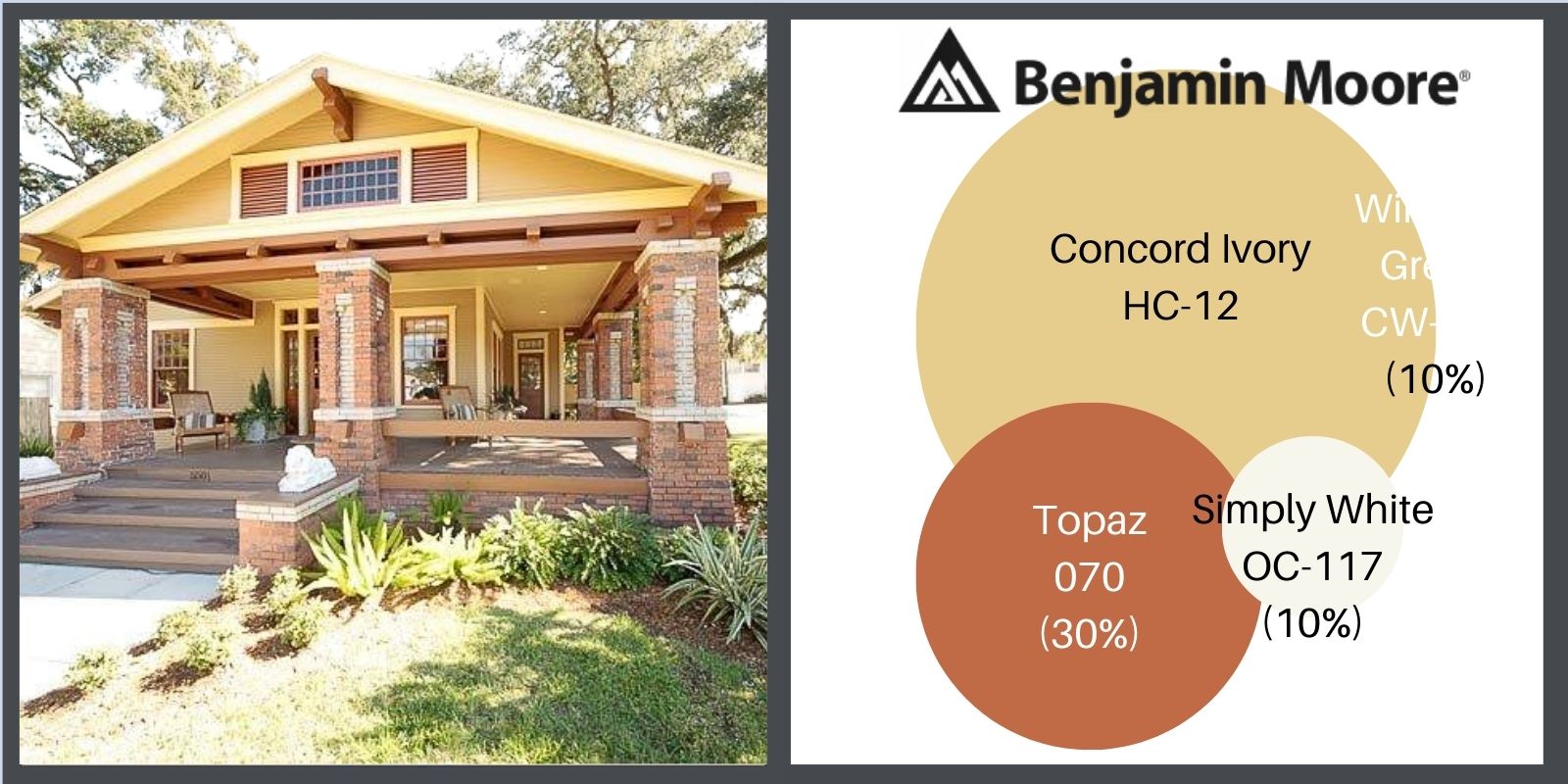
ERIC KRAUSE’S BUNGALOW

Eric is an interior designer who restored this wonderful house in the Old Seminole Heights Area of Tampa, Florida. The restoration is meticulous. Every choice he made is perfect & very reflective of the history of the area.
Here is how he painted the exterior. Note the choices he made in complimenting the natural brick colors.
WAIT, THERE’S MORE!
Part 1, THE COLOR LESSON
How to combine colors on your bungalow to most enhance its features.
Part 2, COLOR HARMONY
Combining colors to please the eye.
Part 3, THE ARTS & CRAFTS MESSAGE
The philosophy behind the beauty.
Part 4, OLD BUNGALOW COLORS
Color choices when our houses were constructed.
Part 6, PAINTING YOUR BUNGALOW EXTERIOR CHECKLIST
Making the big choices.
Part 7, IT’S ALL ABOUT THE CHEMISTRY- LEAD PAINT IN BUNGALOWS
Because I think I’m everybody’s mama.
by bungalow101 | May 20, 2022 | Paint
YOUR BUNGALOW COLORS EXTERIOR CHECKLIST
 It’s time to make some big decisions & there are so many choices, so use this bungalow colors exterior checklist to put yourself on the right path.
I have seen people spend months agonizing over their many choices only to finally choose & be disappointed. I have driven by bungalows whose colors perplex me & I wonder how the homeowner feels about them.
So, now that you know:
A. How colors work
&
B. The philosophy behind the design of your house, let’s figure out how to blend these with your own voice to create a harmonious color scheme for your home. I’m a checklist person. At any particular moment in time, I’ve my paw in many pots. To keep myself on a linear path instead of whirling in circles, mapping out my steps in their proper sequence increases my efficiency. I love the sensation of making check marks by the DONEs!
HERE’S MY EASY-PEASY BUNGALOW COLORS EXTERIOR CHECKLIST
 1. Ideally, the inside & outside of your house should harmonize- conveying the same message in a coordinated voice. Let’s start with focusing on the message. (I’m assuming that if you have made it thus far, you have somewhat of an interest in the Arts & Crafts Movement.) What do you want your house to express to the world? For me, I’m an artist; I love gardening; I’m a humanitarian. I want people to feel comfort & to be uplifted by my house. What do you want your own house to say to the world? Let’s start with that.
2. How do you want your house to serve you? Is it a place of refuge where you come to heal from your battering day in the workplace or in the world? When I was battling Walgreens in our fight to save an important historic building in our town, coming home from a day of petition signings or town meetings, the details of my beautiful house were a healing distraction.
Or, is it a fueling station where you get rejuvenated for the next day? Or, both????
3. Do you work from home? Do you want your house to energize you when you hit that 4 o’clock slump?
4. Do you lead a more casual or a more formal lifestyle? When you throw a party, do your guests chat over ginger tea & gluten free cookies, beer & pretzels, or juice boxes & chicken nuggets?
5. Consider your own color preferences. What colors do you like to wear? What colors draw your eye? Which ones brighten your mood? Take a look at the colors & color groups presented in parts 1, 2 & 3. Consider your reactions to them.
6. How much sun does the front of your house receive during various parts of the day? Does it have overhanging eaves? What direction does it face?
7. Do you want your house to recede, with darker colors or to move forward?
8. How about your landscaping? If you have flowering plants, do they tend toward warm or cool colors?
9. What are the colors of the houses near you? You don’t want to choose a color that is not harmonious or too much the same. Of course, your neighbors could get inspired by you &…
 10. Stepping back inside, do you have textiles that you plan to use- draperies, rugs, upholstery? It is always good to have a starting point & the colors that you are using inside your house can be a great inspiration. I have a rug that guided me in choosing the colors for my Tampa house. (Sorry I haven’t included an image of it for you to see but we keep the rug in storage because my cat has tummy issues.)
11. How about, artwork, pottery & other collections. They are a wonderful inspiration for your palette. They are the things that you love.
12. What are the tastes of your significant other? You might not be the only one who lives in your home & you want your partner to be happy & sweet-tempered.
It’s an interesting phenomenon in my household, that we always work it out in the end. We may start out with completely divergent favorites, but if we persist, & continue looking & searching, we are both always thrilled by our final choice. So, just keep talking.
THE PURPOSE OF THE CHECKLIST
This is not a list to just skim through.
Yeah, YOU! Put down the paintbrush & pick up a pen. Above is a list of things to examine before you even consider hitting the paint store. Painting the exterior of a house is a huge commitment. Truly huge. It’s not a paint chip or paint sample, it’s many square feet of expensive color. so figure out your color self & maybe, review what you know about color. Then, make the decisions & head to the paint store.
AND AFTER YOU HAVE COMPLETED YOUR CHECKLIST, KEEP READING!
Part 1, THE COLOR LESSON
How to combine colors on your bungalow to most enhance its features.
Part 2, COLOR HARMONY
Combining colors to please the eye.
Part 3, THE ARTS & CRAFTS MESSAGE
The philosophy behind the beauty.
Part 4, OLD BUNGALOW COLORS
Color choices when our houses were constructed. .
Part 5, WHAT ABOUT PAINT COLORS FOR YOUR HOUSE?
How to use everything you know about color to pick your dream colors.
Part 7, IT’S ALL ABOUT THE CHEMISTRY- LEAD PAINT IN BUNGALOWS
Because I think I’m everybody’s mama.
STAY IN THE BUNGALOW KNOW!!!
Sign up for our newsletter & receive our FREE E-book, 7 VITAL Things to Do Before You Hire a Contractor.