HOW TO DECORATE IN THE CRAFTSMAN STYLE
 My art training consisted of growing up in museums, exposing me to beautiful objects, exquisitely displayed, ballet with its delightful costumery & stage sets, the arts & crafts of the native Americans of the southwest, & the example set by my mother, who had impeccable taste. From a young age, I appreciated beauty but I never had an aptitude for drawing or painting so I never studied art. My taste was formed by what I saw & what my mother taught me. I grew up learning how to decorate in Craftsman style just by osmosis & later, my bungalows were much admired, with 2 of them being featured in books & magazines & on home tours.
Until just a few years ago, I had never studied design or color theory. To be honest, I had the idea that it was a bunch of arbitrary ideas, made up by academics & had no application in real life. Then, away from home, taking care of my mother when my brother was ill, I had some time on my hands & decided to study design theory. What I discovered is that it is actually a body of data based on observation & application. It does have something to do with me! This information validated my natural/environmental aptitude & also taught me much about creating beauty & harmony that I could actually use to help people decorate their Craftsman homes.
We have come to the first lesson about the principles, or basic rules, of creating visual harmony in design. In the INTRODUCTION, we heard from Gustav Stickley who brought the Arts & Crafts Movement to our country from Europe, endowing it with a distinctly American voice. Part 1 is the the soul-searching session, formulated to help you determine what your lifestyle needs & aesthetic preferences are. Parts 2 & 3 break down interior design into its component parts as expressed in the Movement & as you can apply them to your own bungalow. These elements are the puzzle pieces of design & the way that you fit them together, to decorate in the Craftsman style, is found in the principles.
PRINCIPLES OF INTERIOR DESIGN AS APPLIED TO YOUR BUNGALOW
There are 7 principles of interior design: unity, balance, rhythm, emphasis, scale & proportion, contrast, & details, which apply to any home or even to commercial spaces. How do these basics apply to how to decorate in the Craftsman style?
In order to properly familiarize yourself with the decor most complementary to your home, it is important to understand the aesthetic that inspired every aspect of your home’s architecture. Please watch these videos on the Arts & Crafts Movement which will allow you to see many examples & learn the history of your home’s charming character. Following these principles will help you enhance the features that give it its character & help you create a home that is harmonious, gracious & comfortable.
UNITY/INTEGRATION
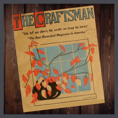 These words of Irene Sergent, in the Craftsman magazine, express the unifying message, the unifying theme, of the American Arts & Crafts Movement in interior design,
“We are, first of all, met by plain shapes which not only declare, but emphasize their purpose. Our eyes rest on materials which, gathered from the forests, along the streams, and from other sources familiar to us, are, for that reason, interesting and eloquent.”
It is not imperative that you spend hundreds of thousands of dollars buying antiques to decorate in Craftsman style. Stickley himself strove to produce his wares for the masses. But, your bungalow has a visual message of its own & through your furniture & decor, color, texture & shape choices, you can amplify this message.
USING SCALE & PROPORTION TO DECORATE IN THE CRAFTSMAN STYLE
Scale is defined as how an element relates to the size of the room it occupies.
Proportion has to do with the way an element relates to other things in the room.
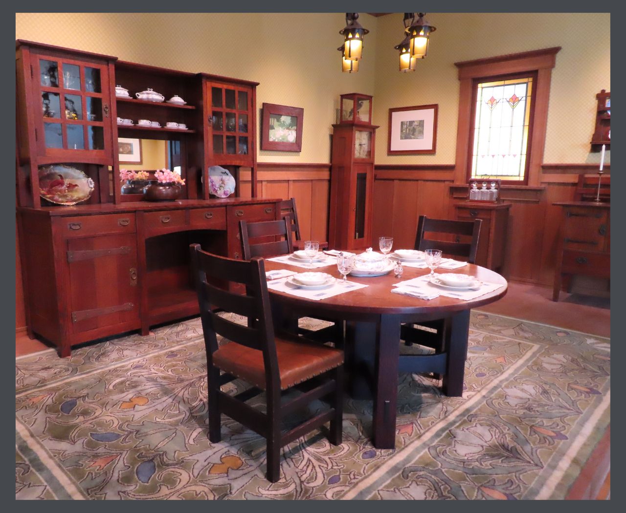
The proportions of this large Stickley dining room are appropriate. Even the pattern on the rug is large as are the pottery & metalwork displayed on the sideboard. This is a great example of how to decorate in the Craftsman style.
I have seen this concept to be tricky in a small bungalow. A petite space requires petite scale furniture, but using a smaller number of medium pieces can also be of benefit. Remember our negative space from Part 2? The key is to maintain enough negative space that each item can be admired easily & you don’t feel like there’s no room for you.
I have a friend who downsized & brought all her more petite pieces with her. And I do mean all. Each object is beautiful & the correct scale for the new condo, but the whole room is just too crowded. There’s no empty space to catch your breath. When I visit her, after navigating my way carefully to the couch, I am distracted from our conversation by my compulsion to silently choose which pieces she should discard!
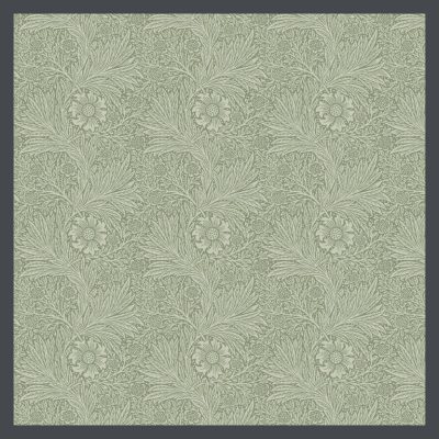 I’m a fan of textiles & encourage the use of simple or low contrast patterns in a smaller bungalow, or room. The Arts & Crafts palette tends to be more muted so it’s a good choice for a house with a reduced square footage, but I still recommend using a more restrained hand in a mini-bungalow. This William Morris pattern, with its muted, pale colors will create a feeling of softness rather than harshly stopping the eye, & would be a good addition to the decor of a smaller space.
In a less expansive room, I’d be inclined to forgo the wallpaper, but a long, frieze (a sculptured or otherwise ornamented band on a wall, near the ceiling) can create space. This lovely one was produced by Grueby Faience of Boston in 1904. Made of glazed earthenware, it would surely draw the eye horizontally, visually lengthening the wall. The term faience was used to describe earthenware with relief molding, which was then decorated with colored glazes. Grueby made a large variety of tiles & pottery in this style.

The repeating pattern keeps the eye moving along, creating visual space. You can create the same effect with a stenciled pattern & learn a new art form too! There are many wonderful A&C stencil patterns that you can find here.
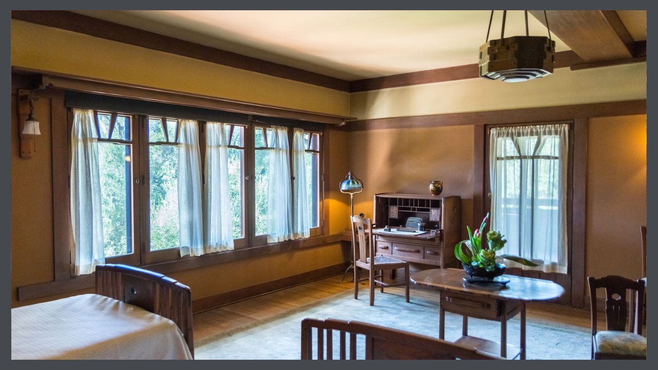
In any size home, you want to make sure that your items are approximate in their sizes. A dinky table with a huge sofa is going to get lost. However, grouping smaller, complimenting items to form a vignette can create balance. This photo of a Gamble House bedroom shows all of the pieces to be in proportion to all the others, from the beds, to the desk to the ceiling fixture.
I am a big believer in using family heirlooms & sometimes you will find that your grandmother’s China cabinet, or your favorite whatever is just too big for the room. I encourage you to figure it out. I moved my cherished 100 year old Chinese kitchen cabinet (With its carved cloud lift motif, it is very Greene & Greene!) around my new house for days after downsizing 400+ square feet. In desperation I angled it on 2 walls, added ornamentation on the top, flopped an obi over it that hangs down about 4 feet on each side, & a piece of a camel bridle (believe it or not!) to draw the eye vertically. This shrank the cabinet horizontally & now this oversize piece works visually in my undersize dining room even though you have to scoot around it a tad to walk through the room.
Older houses tend to have higher ceilings. You can take advantage of this by using taller pieces & placing ornamentation on top of them, as I did with my Chinese cabinet.
Just don’t make your living room so dang perfect that it looks like a hotel room or a museum! Make it your own.
Trot on over to Part 5, the almost final decorating article.
 STAY IN THE BUNGALOW KNOW!!!
Sign up for our newsletter & receive our FREE E-book, 7 VITAL Things to Do Before You Hire a Contractor.


0 Comments