COLOR HARMONY
 HARMONY DEFINED: The degree of harmony is determined by how well the separate parts of a piece of art work together, & have some sort of logical progression in their relationship.
Not just a concept used in music, harmony forms the basis of any visual design in which pleasing color relationships are used to convey a message & create a particular look or feel. We will look at the message of the Arts & Crafts philosophy in Part 3, but for now let’s just concentrate on pleasing color arrangements. Gazing at the Mona Lisa, I am drawn into her beauty & serenity. A great deal of this is created by the colors that are used for the figure & the natural background.
We’re going to assume that you are going to choose to employ several hues, probably 3-ish, on your bungalow because it is traditional to use different colors to point out the different materials- stone, wood, concrete, or elements such as windows, window frames, door, columns, siding etc.
Eye-pleasing combinations are based on different geometric relationships on the color wheel. They can be moved around the color wheel to get different combinations. Let’s look at them.
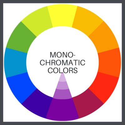
Monochromatic
A color scheme using one color or several colors close to it. This color combination can be very soothing and calming. Maybe not in purple!
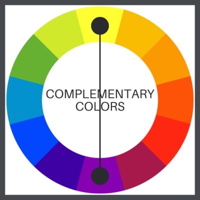
Complementary
Two colors that are opposite each other on the color wheel (example: red and green.) Complementaries can make each other appear brighter. Green next to red makes the red look “redder” & vice versa.
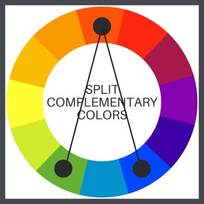
Split complementary
A split-complementary color scheme takes up a primary color & two secondary colors.
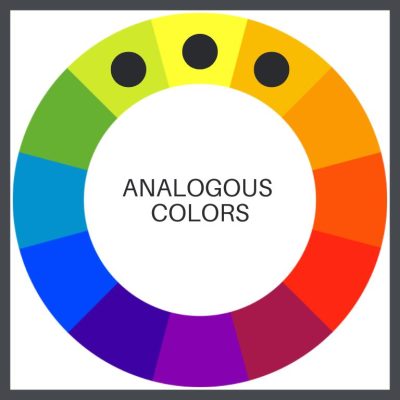
Analogous
Any three colors side-by-side on the color wheel. Analogous colors are often found in nature and can be very pleasing to the eye. Usually, one color is more dominant than the others.
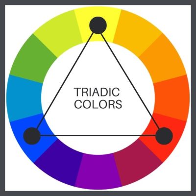
Triadic
Three colors that are equidistant from each other on the color wheel (example: the primary colors, red, yellow and blue.) Think alphabet blocks.
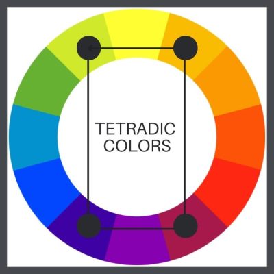
Tetradic
Four colors that form a rectangle from each other on the color wheel. I’m not fond of more than 3 colors on a bungalow. It’s no more appropriate than adding gingerbread to the front gable.
Any of these combinations can be used with any types of color- primary, secondary or tertiary. You can also throw in the variations below. (This is why I want to take you beyond the historic color palettes offered by the paint manufacturers. They are very limiting.)
BUNGALOW COLOR HARMONY- MANIPULATING COLOR
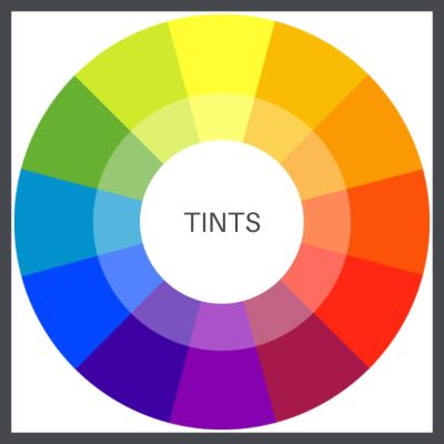
Tints
Adding white to colors.
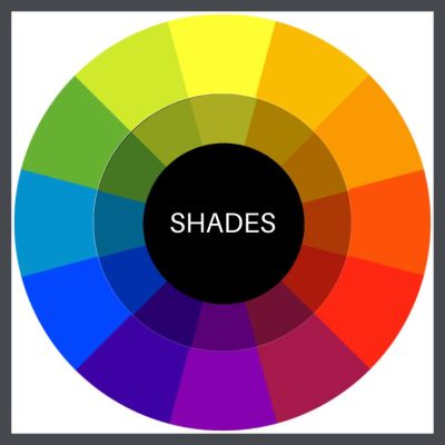
Shades
Adding black to a pure hue.
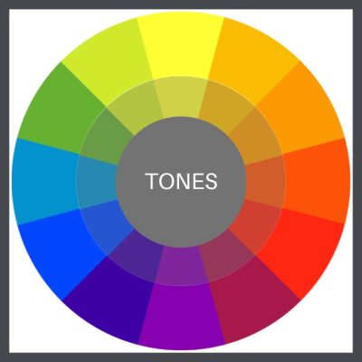
Tones
Requires adding both black & white. The resulting colors are more natural than shades and tints & pure color.
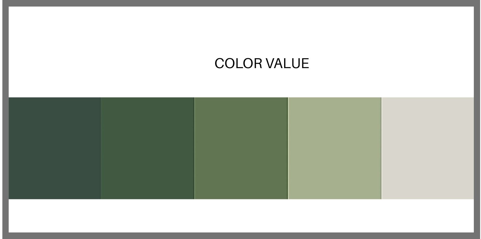
Value
The relative lightness or darkness of a color, which is held constant. A paint color sample strip, showing a color from lighter to darker, is a perfect example of changing value.
We are so-o-o-o much closer to looking at actual, historically appropriate colors, but, there’s more! We’re going for the Full Monty of bungalow color.
A FEW MORE BUNGALOW COLOR TERMS
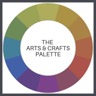
Palette
A particular range, quality, or use of color, resulting in harmony.
Example- the Arts & Crafts palette- the colors used by the artists & craftspeople of the Arts & Crafts Movement.
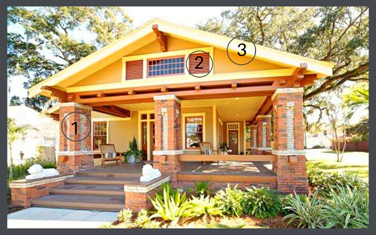
Key color (1 below)
The most important color of your design. It’s the color you can’t change, such as grass or wood or brick or stone, or the color of the element to which you want to draw attention. You need to know your key color before you can determine your color harmony. This will be your starting point.
Accent color (2 below)
One used in comparatively small quantities in a space, to add impact & interest. A classic decor rule that states that 60% of the space/object should be a dominant color, 30% should be the secondary color & the last 10% should be an accent. (70, 20 & 10 work well too.)
You can easily take a perfect combination of colors, & by using them in the wrong proportion, create a gaudy mess.
Contrast (3 below)
The arranging of opposite elements, such as light versus dark. The house shown below is textbook perfect bungalow color harmony.
ONE MORE TIP
Here’s a video that you can view to see all these combinations in action. Please watch it twice, but come back! There’s more!
Before you pick up your keys to head to the paint store, I also suggest that you buy & use the color wheel shown in the video-a great tool that you can just fool around with & learn a huge amouint about color.
KEEP READING!
![]() Part 1, THE COLOR LESSON
Part 1, THE COLOR LESSON
How to combine colors on your bungalow to most enhance its features.
![]() Part 3, THE ARTS & CRAFTS MESSAGE
Part 3, THE ARTS & CRAFTS MESSAGE
The philosophy behind the beauty.
![]() Part 4, OLD BUNGALOW COLORS
Part 4, OLD BUNGALOW COLORS
Color choices when our houses were constructed.
![]() Part 5, WHAT ABOUT PAINT COLORS FOR YOUR HOUSE?
Part 5, WHAT ABOUT PAINT COLORS FOR YOUR HOUSE?
How to use everything you know about color to pick your dream colors.
![]() Part 6, PAINTING YOUR BUNGALOW EXTERIOR CHECKLIST
Part 6, PAINTING YOUR BUNGALOW EXTERIOR CHECKLIST
Making the big choices.
![]() Part 7, IT’S ALL ABOUT THE CHEMISTRY- LEAD PAINT IN BUNGALOWS
Part 7, IT’S ALL ABOUT THE CHEMISTRY- LEAD PAINT IN BUNGALOWS
Because I think I’m everybody’s mama.
 STAY IN THE BUNGALOW KNOW!!!
Sign up for our newsletter & receive our FREE E-book, 7 VITAL Things to Do Before You Hire a Contractor.


“I’m not fond of more than 3 colors on a bungalow.”
Does white trim on the exterior count as one of the three colors? I have a sage, green home with a dark sage accent around the bottom concrete block, a black roof and white trim.
I emailed some colors to you. Look at the Pinterest links that I included & let me know how you feel about them.
My 1928 Bungalow has about 2 feet of red brick on the bottom and chimney. Then yellow siding, yellow gutters and fascia and a brown roof. it is just so much yellow. What do you suggest.
I am so sorry to have not responded! Could you please send me some photos? Your house sounds wonderful & I would love to give you some suggestions.
Send to Suzanne@bungalows101.com.