MORE ON BUNGALOW STYLE INTERIOR DESIGN
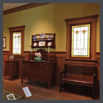 We have come to the second lesson about the principles of creating visual harmony in design. The elements of design are the puzzle pieces of design & the way that you fit them together, to decorate in the Craftsman style, is found in the principles. These bungalow style interior design tips are the basics of all good design & if applied, will assist you in creating the home that you want. Perhaps you will never have a Stickley dining room like the one at the American Arts & Crafts Museum in St. Petersburg, Florida, but by learning about Arts & Crafts design you will become more confident & satisfied in putting together your home.
I suggest that you should read the articles leading up to this one. They cover the basic elements of design which you will use in the principles written about here & #4 is about the other principles.
Here is the second half of the 7 principles of interior design: unity, balance, rhythm, emphasis, scale & proportion, contrast, & details, which you can use in any home or even to commercial spaces. Let’s see how you can apply them.
USING BALANCE IN BUNGALOW STYLE INTERIOR DESIGN
 Here we come to the concept of visual weight. Visual weight refers to the degree to which an object draws the eye, which is determined by its size, color and shape. You walk into a room & there’s a mouse & an elephant. Your attention immediately goes to the elephant because of its enormous size. You see 2 squares & one is pale blue & the other bright red. Your attention is instantly on the red. Objects with a regular shape, such as a square or a circle, appear heavier than objects with an irregular shape, such as a paisley, a tear-drop shape with a curled end. The irregularity gives the impression that mass or weight has been removed from a regular shape.
Balance is defined as a condition in which different elements are equal or in the correct proportions & create a feeling of stability. Nobody ever looked at a picture of the Titanic sinking & felt anything but terrible.
There are three ways to achieve visual balance & most homes contain a combination of the different types.
Symmetry
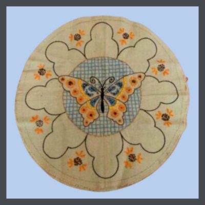 Symmetry is achieved by positioning items evenly along a central axis. It creates a sense of stability, calmness & formality. Mimicking nature- leaves, snowflakes, bodies- this type of balance is often used in A&C design. A good example of this is William Morris’ designs.
Symmetry occurs when each side is a mirror of the other, dividing the space into 2 even parts. This is a formal, orderly look & is used often in Arts & Crafts.
Over the decades, life & design have become more casual. At the beginning of the last century, women wore dresses, men wore ties, & formal symmetry was the order of the day. Additionally, the Arts & Crafts Movement, both philosophically & aesthetically, is based on nature, in which there is often great symmetry.
Asymmetry
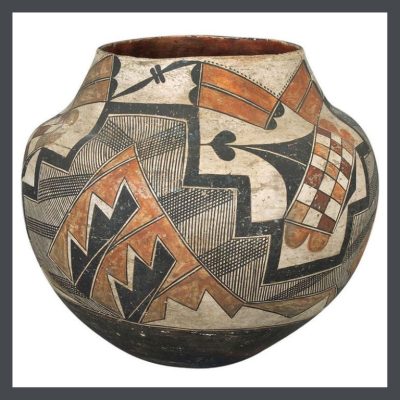 Asymmetry is achieved by positioning an uneven number of things along the central axis. The feeling created by this is more modern, with a greater sense of motion.
This native American pot is a wonderful example of asymmetry. Through the use of pattern & color, it creates a visual balance on all sides. Mid-Century is also a good example of the frequent use of asymmetry.
An asymmetrical design is a looser approach. You still strive for visual balance, but without using mirror imagery. Perhaps your couch would be balanced by 2 chairs that would be positioned across from it. Or you might place a large, “heavier” piece of pottery on one side of your mantle & a couple of “lighter” ones on the other.
Radial Balance
Radial balance is formed by placing elements around a circular center core. A dining table with a round fixture, surrounded by chairs is a good example of this. This is is a formal look & often found in Craftsman design.
At the other end of the spectrum is radial balance. This more intricate approach requires establishing a natural focal point and having other smaller pieces diverge from it evenly. A fireplace could be the example of the focal point in question, and then you could carefully arrange other items facing toward it, for example.
RHYTHM
The fetus hears her mother’s heart, the steady pulse of life & once outside the womb, is comforted by lying on her mother’s breast.
Rhythm, a part of every aspect of life, carries us forward in time. In design, it moves the eye from one point to the next, in a pattern of steady repetition, or a sudden change in pattern, creating contrast or focus.
This heard of elephants thunders across the wall in this tile made by Grueby Faience Company in 1900. I have never seen/heard/felt a herd of elephants moving across the plain up close & personal, but I have seen & heard it in films & the rhythm was powerful!
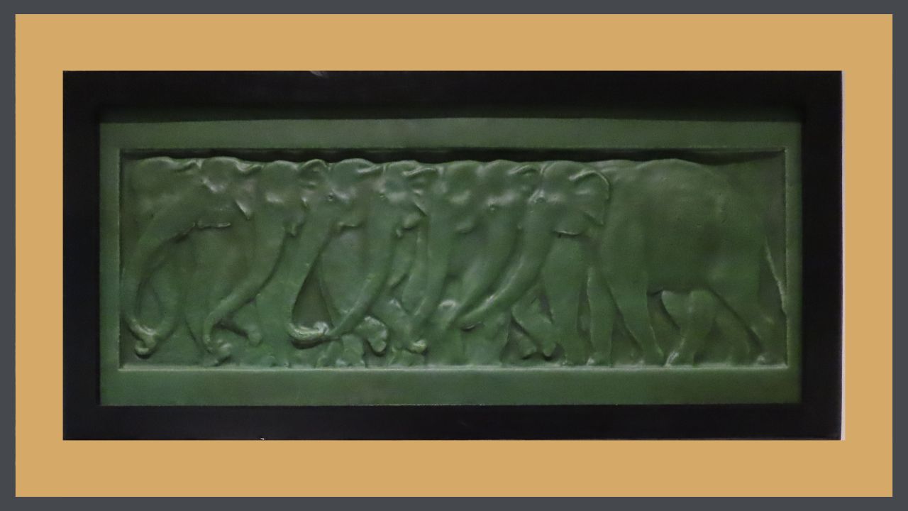
The Arts & Crafts message is one of the natural world, with its gentle (& not so gentle!) rhythm & its subtle variations. This visual rhythm can be created by repeating colors, materials, textures & shapes at varying intervals. Or a frieze of thundering elephants!
The interior features of your house form a basis for this repetition with your wood built-ins & trim. You can provide a contrasting pattern with your textiles, art & other accessories to decorate in the Craftsman style.
HOW TO EMPLOY CONTRAST IN BUNGALOW STYLE INTERIOR DESIGN
 This leads us to contrast, sudden breaks in the rhythm. Linen curtains against the dark of the window frame, pillows on the dark upholstery, creamy slag glass in the lamps on the tables, even the glow of the logs burning in the fireplace, below the dark mantel form a contrast against your dark wood trim.
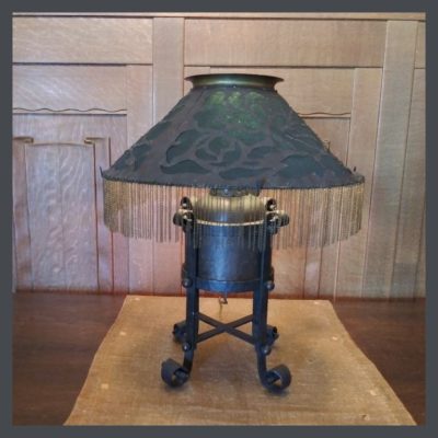
The Arts & Crafts aesthetic is on the subtle side, like Mother Nature herself. For example, in this lamp, there are many contrasts, but you have to look for them.
There’s an interesting combination of straight & curved lines that define the piece. In the shade, you see curved, organic cut-outs, but the shade itself is almost a perfect triangle. The straight vertical legs come down into cute little curled feet. Even its shape is rather contradictory. It is both a rolly-poly elf, but is also elongated & moves your eye vertically. The oat colored runner on which it sits provides great contrast to the allover dark appearance of the lamp, as well as the wood wall behind it & the table on which it sits. Then what’s with the fringe on the shade? To me, it is a totally incongruous piece of frou-frou, but it works. I find it charming!
EMPHASIS
The word is defined by Oxford as “special importance, value, or prominence given to something.”
When you enter a space for the first time, it is the focal point that orients you to all the other elements. This Is where at the eye naturally comes to a halt, & you visually align the whole room to that point. In many bungalows, the focal points are provided by the architecture: your fireplace with its art tile surround, a beautiful built-in sideboard in the dining room, a sweet little inglenook, leaded glass windows. (All features found only in quezillion dollar homes today, by the way!)
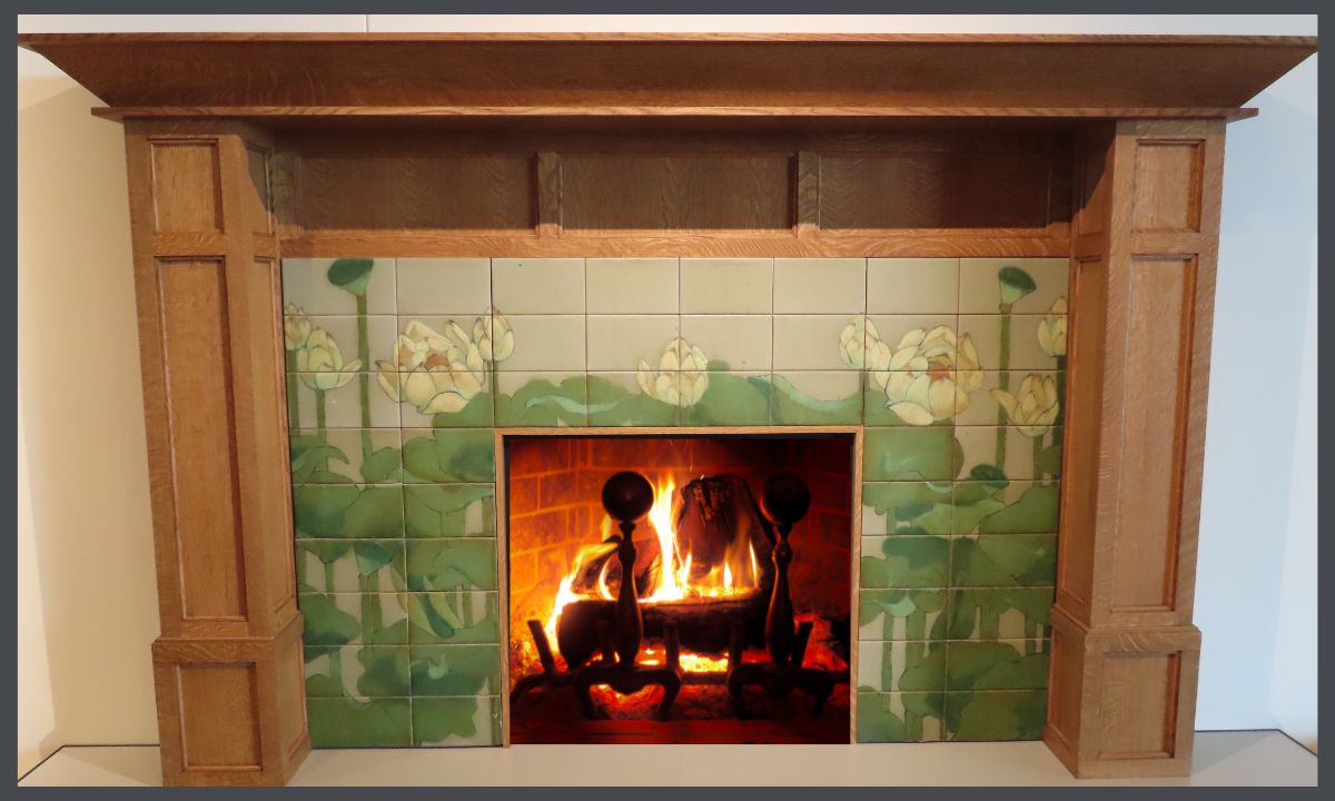
Emphasis can be achieved by using line to point at a feature, contrast, negative space, color, light or a change in rhythm. A fireplace like this one would certainly do the trick!
USING DETAIL IN BUNGALOW STYLE INTERIOR DESIGN
While your furniture will help set the tone, it’s the details that will set your bungalow apart. There are so many wonderful choices in textiles, lighting, pottery, metalwork & art that you can fully express yourself while conveying the Arts & Crafts message.
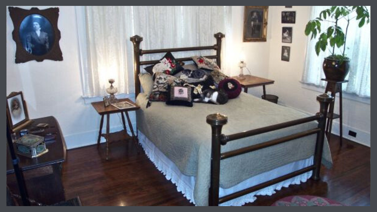
This room in the Hare House, appears in Jane Powell’s book, BUNGALOW: THE ULTIMATE ARTS & CRAFTS HOME despite the fact that yeah, it’s Victorian. However, Linda & I squawked loudly about the fact that not every bungalow buyer trotted out to buy new furniture for their house. It just wasn’t practical. The man who built my house, Reverend Alfred Hare, was known as a good businessman & helped several congregations pay off the mortgages on their church buildings. Throughout the house you see where he chose to spend & where he chose to scrimp. I can guarantee his expenditures did not include new furnishings for the private areas. This argument impressed Jane who was always a sucker for a good backstory & the bedroom appears on Page 238 in all its glory. You can even see the image of my 3 year old mama on the dresser.
So, here, to the left of the bed, you see my grandmother as a young woman. She probably commissioned this portrait with the first money she made as a teacher. One the other side is my husband’s grandfather as a child. I wish the colored, hand-painted background could be seen. On the front wall, photos of my mother-in-law as a child in the 20’s. On my dresser sits my grandmother’s tin candy box which holds her embroidered hankies, & if you look very carefully, you can see her dresser set. The portrait is of my favorite uncle. The lamps beside the bed are oil lamps that my mother had wired for electricity. And on the bed, my kitty pillow collection. Of course the best part of the room is my dear kit, Buhkai, the Big- hearted bungalow kitty. You can read his story here!
As I did, you can express your preferences & tell your story in all of these choices. At the same time, you can honor the history & philosophical underpinnings of your bungalow, the trees who gave their lives for its lumber, the architect who designed it, the craftsman who built it & the people who lived their lives & built your neighborhood & your town, all there, before you were even born.
I’m sure it’s a heck of a story!
Make sure that you begin at the beginning to learn everything you can from this series.
 STAY IN THE BUNGALOW KNOW!!!
Sign up for our newsletter & receive our FREE E-book, 7 VITAL Things to Do Before You Hire a Contractor.



0 Comments