THE ARTS & CRAFTS MESSAGE
 The Arts & Crafts message is evident in every piece of design that flowed from the masters of the Movement 100 years ago & is passed on by those in today’s Revival.
The motivation & purpose of art is communication, the passing of an idea from one person to another. Going back to the drawings of the early cave dwellers which may have been the works of shamans, illustrating their visions, humankind has used symbols to communicate ideas & emotions & to influence the thoughts & behavior of others, even the gods.
 Who has not been moved to tears by a mournful song or invigorated by a joyful tune? Though we have never met the songwriters or the singers, (Well, I actually did. I was a groupie!) we feel intimately connected with them. We hear them & we respond to them. That communication has an emotion & hearing it changes our own emotions.
We perceive visual images daily, be they advertising, art or our friends’ latest antics on Facebook. It’s all communication- the passing of ideas from one person to another.
THE MESSAGE & CULTURE
 The communication of design both expresses & influences culture. Let’s define culture as the customs, arts, social institutions, technologies & achievements of a particular nation, people, or other social group, at a particular time. They are intertwined & build on one another. The art of a culture expresses that culture & at the same time, the voice of the artist guides the culture.
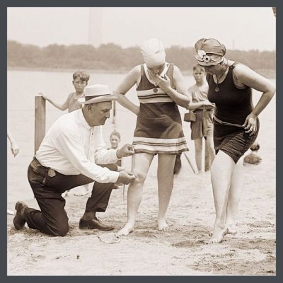
This image conveys woman from the viewpoint of the 1920’s & communicates to them from that viewpoint. It says that she should be on display, with her best leg forward, thin & young, but not too much on display- a man should determine the appropriateness of the length of her beach attire. Nobody is objecting to this demeaning treatment. It’s the reality, the law, of the times. It is further solidified by the image. (Disclaimer- I’m not advocating here for being unhealthy, unattractive nor for parading oneself like a piece of meat. There’s a happy medium here. No pun intended.)
So how does this relate to our good buddy, the bungalow?
THE ARTS & CRAFTS MESSAGE & YOUR BUNGALOW
 What does your bungalow want to say?
Your bungalow’s design sprouted from the Arts & Crafts Movement in England, a reaction to the shoddy quality goods & the disruption of society that came about during the Industrial Revolution. The Movement was founded on a belief in good craftsmanship, which stresses the inherent beauty of the material, the importance of nature as inspiration, & the values of simplicity, utility, & beauty.
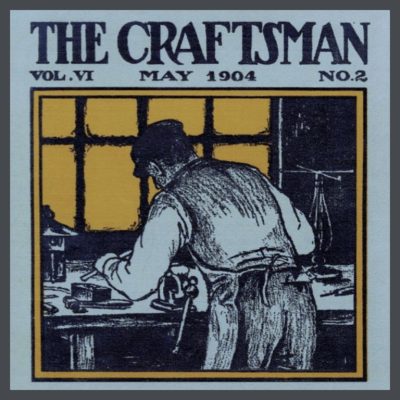
In 1889, Gustav Stickley traveled to Europe & brought the philosophy & the design aesthetic to America, created a furniture line & starting a magazine which focused on Arts & Crafts, American style. This dinky paragraph is a hugely glibbed story of the Movement & Stickley’s influence so I urge you to learn more about the Movement. I have curated some amazing videos that will immerse you in the subject, including some about Stickley. Watch them & I promise that you will never look at your bungalow the same way again.
So, your home is most beautiful when the colors you choose reflect the Movement. These colors create a harmony, with one another, with the design & the material elements of your bungalow, & with Mother Earth herself. Let’s take these elements & figure out the best /most harmonious, color scheme for your house. Part 5 is all about houses, (Stay with me here.) but we’re going to look at color theory just a bit more. It is beautifully demonstrated in the pottery of the era/Movement.
ARTS & CRAFTS COLOR THEORY IN ACTION
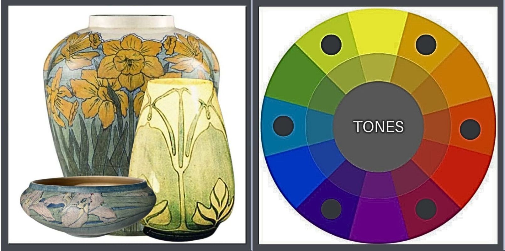
William Henry Grueby displayed his art pottery in 1897 for the first time in the exhibition of The Society of Arts & Crafts of Boston. The popularity of his work grew quickly because of its simple designs & the beautiful, nature inspired, matte glazes that he had developed. This pottery had little ornamentation other than form because of these the stunning, natural beauty of these glazes, which motivated David Rago, an expert in American art pottery, to write, “a good piece of their work looks more harvested than potted.”
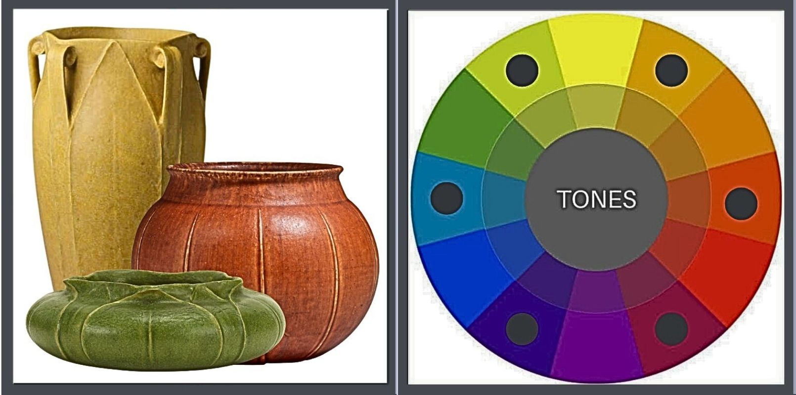
Grueby pottery is a clear voice for the Movement. In every way it expresses:
- A reverence for fine craftsmanship. That feature rings out loud & clear, both from the exquisite design & from the glazes that Grueby worked years to perfect.
- Inherent beauty of the material. The glaze changes the raw look of the bare clay very little, other than adding color.
- As far as being nature inspired, I agree with Rago’s statement that it looks like it was harvested & I’m going to add, “organic, local & fresh!”
No doubt about its simplicity or its beauty.
Now, let’s look at their colors. Each piece is a poster child for the colors of Mother Earth, tending to feature tertiary tones. They are not clear primary or secondary tones & are further muted by the addition of black & white.
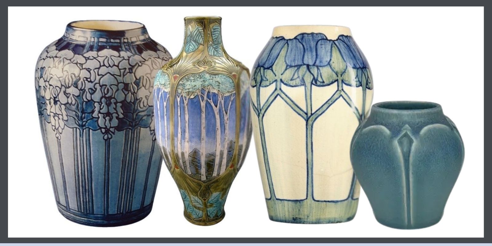
I’m going to shift over to the more ornamented Newcomb pottery so that we can look at color harmony.
They deliver the same message, from a different, equally harmonious voice. Trend alert! Notice that they too are tertiary colors, toned by black & white.
American Arts & Crafts pottery produced from 1895 to 1940, they were thrown by hand (by men) & decorated (by women), each one unique. They were all required to be functional, as dinnerware or vases, but the aesthetic aspects of nature & fine craftsmanship were regarded as highly important. Each piece was formed of local clay & their subject matter reflected the natural world around them. And there is no doubt that they are enchantingly beautiful. I offer them to you as a way to further train your eye.
WHAT ABOUT BLUE?
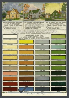
Blue is a found in the A&C palette, as seen in the Seroco palette (Pure Blue.) It is a color often used in pottery. It’s the color of the sky & you’d be hard-pressed to find something more natural than the sky. It complements brick beautifully, as well as off-white & greens & grays.
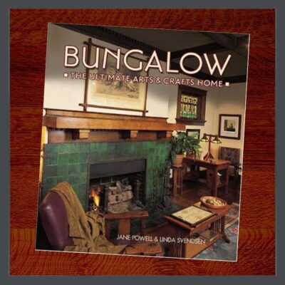
Jane Powell’s BUNGALOW:The Ultimate Arts & Crafts Home (page 70) shows a very cool Gothic Revival in Denver that is painted 2 shades of blue. In my mind’s eye there’s another blue one, I believe in Portland, but I’m failing to locate it. Dang!
I would paint an A&C house blue.
I’M GOING TO GO YOU ONE CRAZIER
“The happiest omen for a New Year is first Mount Fuji, then the falcon, & lastly eggplant.”
-A famous Japanese proverb
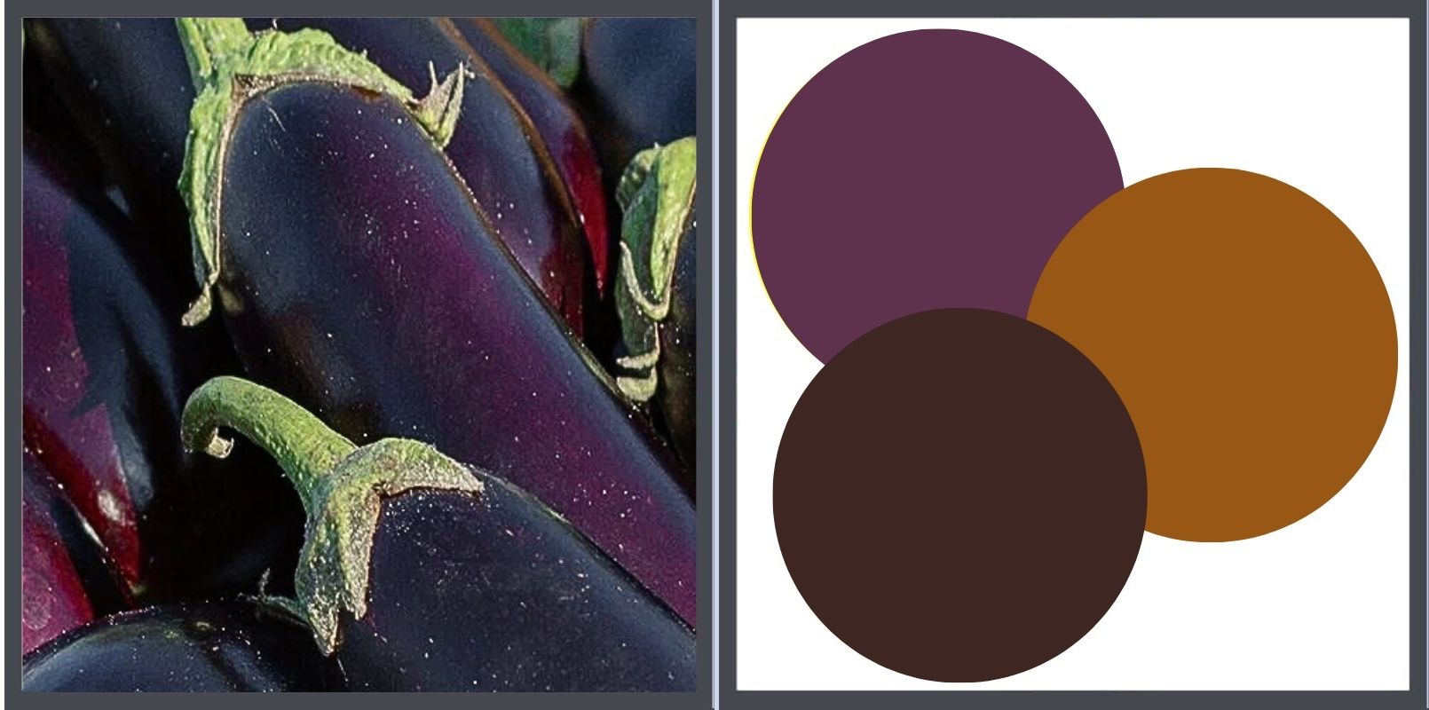
One of my favorite bungalow ACCENT colors is eggplant. Allow me to ‘splain.
Firstly, purple was my favorite color for many years. It was Jane Powell’s favorite color & she drove a purple P.T. Cruiser. (Mine was red.)
Solanum melongena, eggplant, aubergine, bringal (India) is a member of the Nightshade family, Solanaceae. At one time, it was believed to be highly poisonous & indeed, if consumed in large quantities, its flowers & leaves are toxic.
 Jane always felt that anything was permissible with a good backstory. Here’s mine. The colors of the A&C palette were inspired by nature. To be inspired by something, you need to see it, hear it, smell it, etc. However, eggplant was difficult to grow in England. It likes warmer, sunnier climates so its fruit is reluctant to ripen even in warmer areas. Being considered poisonous, why would you waste valuable greenhouse space? So, nobody saw it to be inspired by it because in my heart-of-hearts, I believe they would have been.
But 100 years later, I saw an eggplant & I feel that its color conveys the Arts & Crafts message clearly & beautifully. Combined as an accent, with brown & deep gold, it creates a lovely, natural palette. Have I seen it on any paint cards? No. Do I care? No again, but I’m still looking. I’m thinkin’ Jane might have felt the same way.
SO WHAT DOES THE ARTS & CRAFTS MESSAGE HAVE TO DO WITH MY BUNGALOW’S COLORS?
KEEP READING!
![]() Part 1, THE COLOR LESSON
Part 1, THE COLOR LESSON
How to combine colors on your bungalow to most enhance its features.
![]() Part 2, COLOR HARMONY
Part 2, COLOR HARMONY
Combining colors to please the eye.
![]() Part 4, OLD BUNGALOW COLORS
Part 4, OLD BUNGALOW COLORS
Color choices when our houses were constructed.
![]() Part 5, WHAT ABOUT PAINT COLORS FOR YOUR HOUSE?
Part 5, WHAT ABOUT PAINT COLORS FOR YOUR HOUSE?
How to use everything you know about color to pick your dream colors.
![]() Part 6, PAINTING YOUR BUNGALOW EXTERIOR CHECKLIST
Part 6, PAINTING YOUR BUNGALOW EXTERIOR CHECKLIST
Making the big choices.
![]() Part 7, IT’S ALL ABOUT THE CHEMISTRY- LEAD PAINT IN BUNGALOWS
Part 7, IT’S ALL ABOUT THE CHEMISTRY- LEAD PAINT IN BUNGALOWS
Because I think I’m everybody’s mama.
 STAY IN THE BUNGALOW KNOW!!!
Sign up for our newsletter & receive our FREE E-book, 7 VITAL Things to Do Before You Hire a Contractor.

0 Comments