WHAT ABOUT PAINT COLORS FOR YOUR HOUSE?
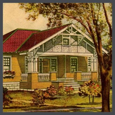 Well, we have looked at THE COLORS LESSON in Part 1., which reviews the basics of color theory that we all learned in school. Part 2., COLOR HARMONY, was all about how to combine colors on your bungalow to most enhance its unique features. THE ARTS & CRAFTS MESSAGE, Part 3., was a lesson in the social & design philosophy that originated in England over 100 years ago, & how it applies to color. In the next one, Part 4., LET’S LOOK AT SOME BUNGALOW COLOR, we viewed actual paint color samples of the period.
So what now?
PUTTIN’ ALL THAT BOOK LARNIN’ TO USE
We studied the use of color theory & also color harmony as it applies the Arts & Crafts Movement. Now we’re going to put all that information together & toss in modern day paint colors by Ben Moore, that you can use on your own house. We’ll go from some simple combinations, to more complex harmonies.
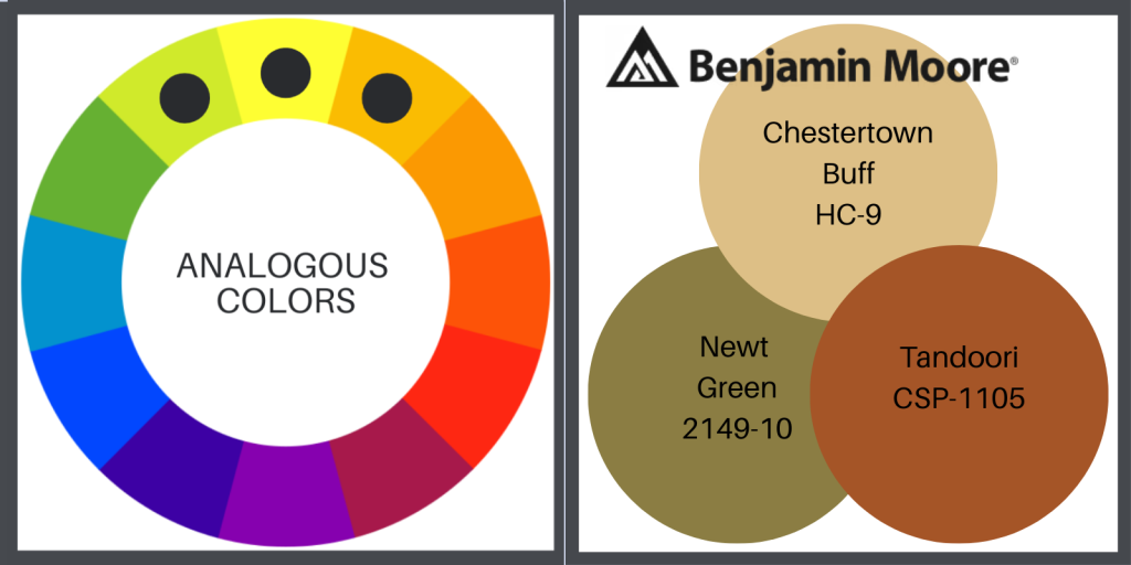
What you will see in the images below are the harmonies of the color wheel translated into colors from the Sears Seroco historic palettes. Below on the left is our starting point, the wheel. On the right, are the Ben Moore colors, as translated from the historic colors.
In some cases I have shown the Seroco colors to be more subdued in their BM editions. I prefer palettes that meld with their environments, so the BM & the Seroco don’t always look the same. The BM colors that I have chosen might be more muted, or more toned.
ANALOGOUS PAINT COLORS FOR YOUR HOUSE
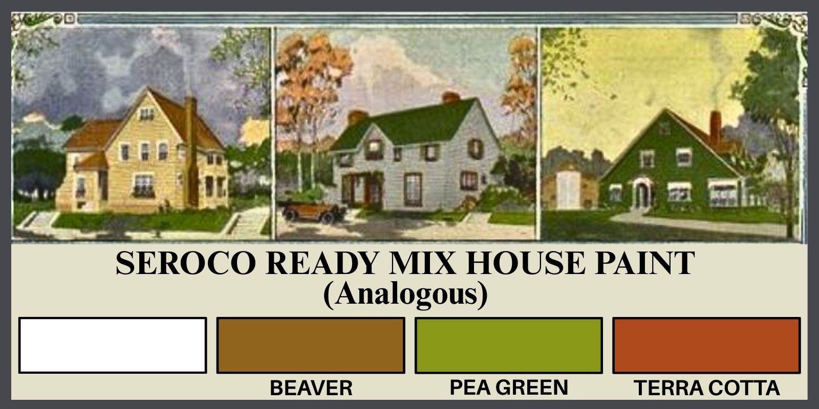
These groups, generally composed of 1 side-by-side, 1 secondary & 1 tertiary color, create a cohesive combination, sharing one another’s tones. They are the color harmony of nature- the cool greens of the forest in one section of the wheel & the warm reds & oranges of the same forest in the fall, on the other side of the wheel. It’s interesting to see what combinations pop up when you slide around the color wheel.
Here is the analogous color wheel, with the same colors from Ben Moore, as translated from Seroco, above.
COMPLIMENTARY PAINT COLORS FOR YOUR HOUSE
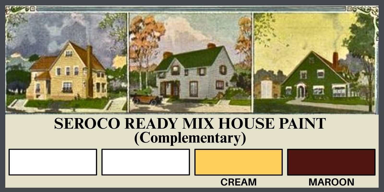
Using 2 contrasting/complimentary colors is a great way to achieve bold color, without creating clutter. This combination simplifies the process & the pallet. It’s also a handy choice when you have another design element such as stone, brick or unfinished wood, that you must include. Below is an example of this harmony choice, again featuring the color wheel on the left & the current, Ben Moore version of the historic color on the right.
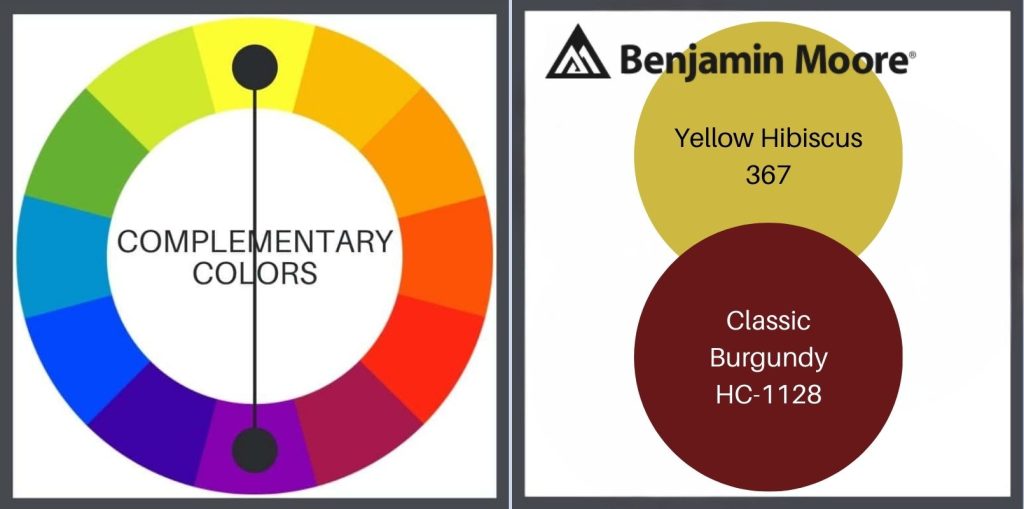
By spinning the color wheel, to the right or to the left, & adding black & white in differing amounts to the base color, you can expand these color choices.
MONOCHROMATIC
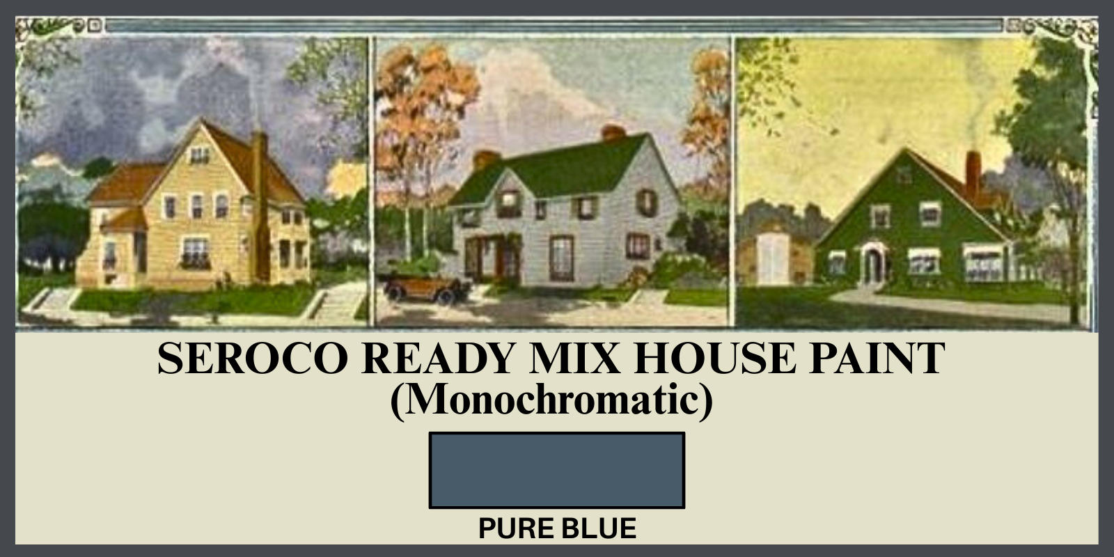
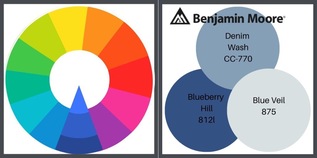
Next is monochromatic color, a base color repeated from light to dark. This can be created by adding more or less white to the base color, but also by adding black or gray. It doesn’t sound very exciting, but you can create a dramatic look by using this palette. Below is Ben Moore’s version.
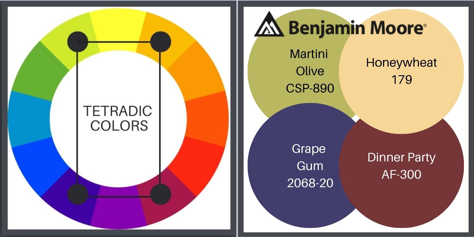
TETRADIC PAINT COLORS FOR YOUR HOUSE
I generally suggest using no more than 3 base colors, because we don’t want to become a fussy Victorian & because using 3 is the most pleasing to the eye. There’s even a rule about it, called simply, The Rule of Three. Now, any group of odd numbers will work, but the simplicity of 3 really nails it, proving a visual that is balanced, relaxed & interesting. It’s just how we are wired.
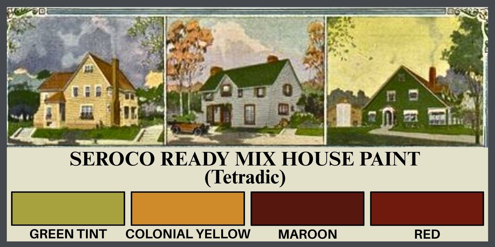
But, let’s go our own way for a minute, & see what we can do with the 4 colors of the tetradic color wheel. Above is the Soroco historic paint sample sheet, & below is our friend Ben. Seroco didn’t give me much for purple so I fudged. Let me know what you think in the comment section below!
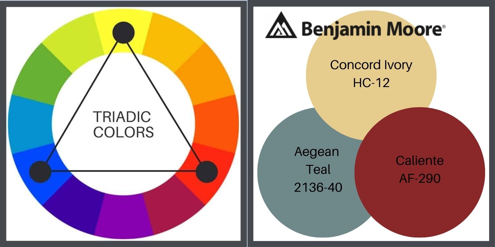
TRIADIC PAINT COLORS FOR YOUR HOUSE
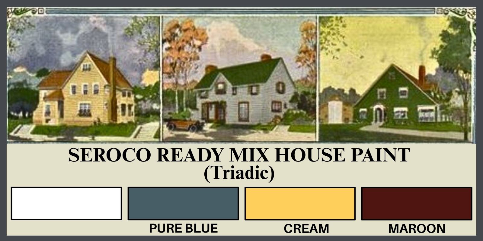
Because this color wheel example displays only primary colors, the Soroco & the resulting Ben Moore choices are quite a bit different from the wheel. While Ben does offer some clear, primary hues, the historic (Soroco) sample tends more tertiary, a la the smaller, more earthy A&C range.
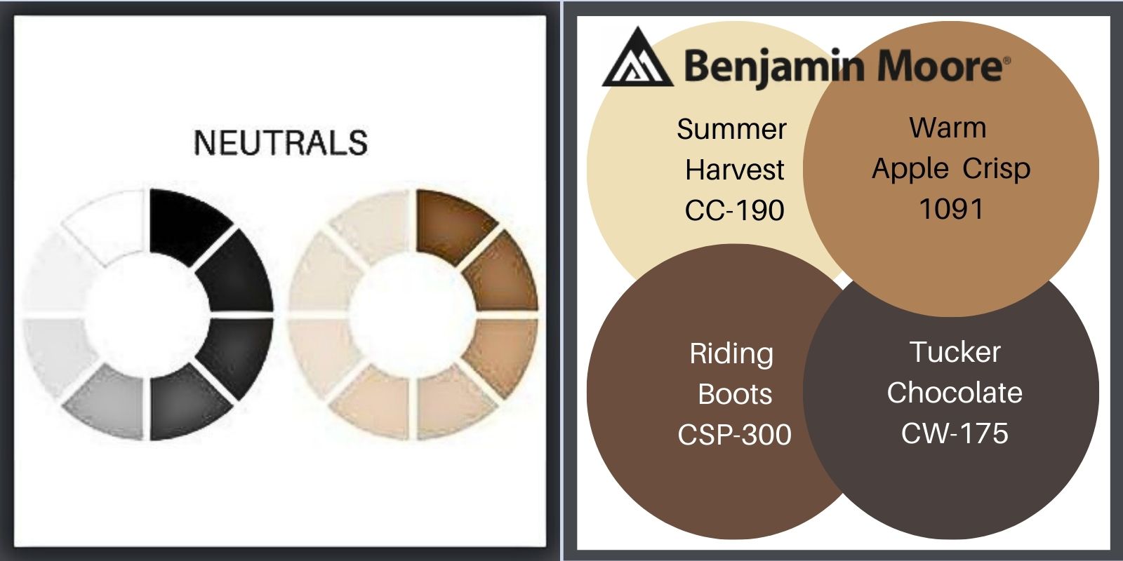
NEUTRAL PAINT COLORS FOR YOUR BUNGALOW

Always sophisticated, this palette is simple but can still surprise as strongly as most any combination of colors. (Notice I said most. I’ve seen some poor bungalows I can describe only as Key West inspired. We’re talkin’ strong! I prefer the lime to be in the pie.) I did not choose to employ the black in the Ben Moore palette. I prefer the little bit softer dark, dark brown.
Of course you can also mix any hues with neutrals. It’s a lovely combination!
THE GREAT DIVIDE
The proportion of area for each color is as important as the choice of colors. Because there is so much color on a home’s exterior, you can easily create an imbalance that will visually distort how your house appears. An imbalance of color will create disharmony & confuse the eye. It wants to know where to focus.
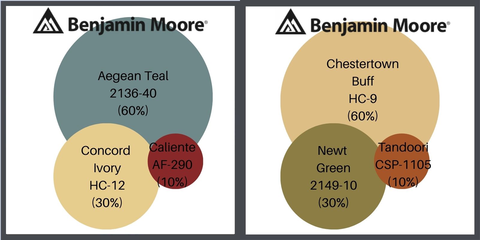
Correct color proportion is 60% dominant, 30% secondary, 10% accent. The dominant color sets the mood. The theme of the Arts & Crafts Movement is nature, but, within that, houses can be more or less formal.
THE HARE HOUSE
The Hare House was shingled & had never been painted. I replaced about 10% of the shingles due to sun damage, then chose a stain color that would receded the house even further back than it sat on its large lot. I had a very large, old pine tree & had planted a stand of birches & I wanted to honor their space. I gave my painter the 3 chips- one stain & 2 paint & sped off to the office. Upon my return, I discovered that he had not used stain, but paint. It broke my heart.

The Hare House was very formal. I chose traditional colors for it- my 60% is a very dark brown, a neutral, to express this.
My secondary, 30% color was a redder brown. The contrast was not huge, but it accentuated the change of material & made it easy to see the detail in the trim.
The green detail (the 10%-ish) on the windows, a nod to the garden was a subtle complimentary color to the red brown. Both the red & green were heavily toned, muddy, tertiary colors, with the red leaning cool & the green leaning warm.
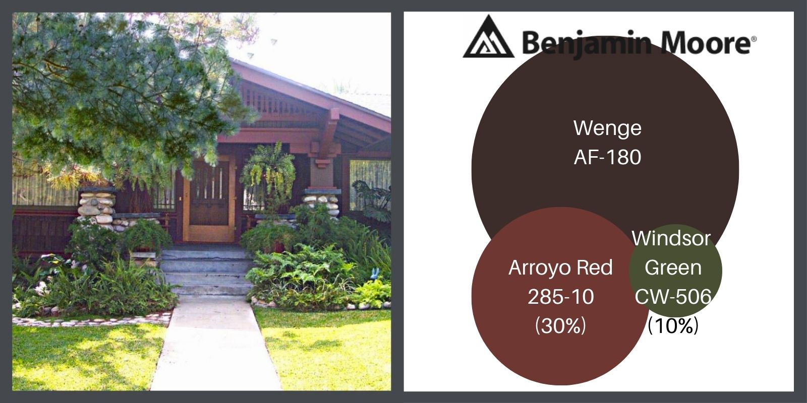
You can fudge with 70%, 20% & 10% if the details of your house necessitates it. This house also shows a good example of of the use of color with a natural element, such as stone.
ERIC KRAUSE’S BUNGALOW
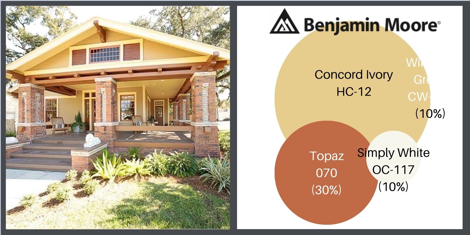
Eric is an interior designer who restored this wonderful house in the Old Seminole Heights Area of Tampa, Florida. The restoration is meticulous. Every choice he made is perfect & very reflective of the history of the area.
Here is how he painted the exterior. Note the choices he made in complimenting the natural brick colors.
WAIT, THERE’S MORE!
![]() Part 1, THE COLOR LESSON
Part 1, THE COLOR LESSON
How to combine colors on your bungalow to most enhance its features.
![]() Part 2, COLOR HARMONY
Part 2, COLOR HARMONY
Combining colors to please the eye.
![]() Part 3, THE ARTS & CRAFTS MESSAGE
Part 3, THE ARTS & CRAFTS MESSAGE
The philosophy behind the beauty.
![]() Part 4, OLD BUNGALOW COLORS
Part 4, OLD BUNGALOW COLORS
Color choices when our houses were constructed.
![]() Part 6, PAINTING YOUR BUNGALOW EXTERIOR CHECKLIST
Part 6, PAINTING YOUR BUNGALOW EXTERIOR CHECKLIST
Making the big choices.
![]() Part 7, IT’S ALL ABOUT THE CHEMISTRY- LEAD PAINT IN BUNGALOWS
Part 7, IT’S ALL ABOUT THE CHEMISTRY- LEAD PAINT IN BUNGALOWS
Because I think I’m everybody’s mama.


0 Comments