OLD BUNGALOW COLORS!
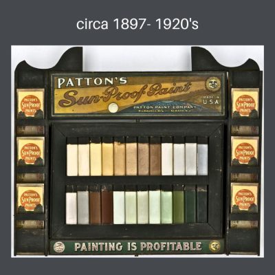
 There were many paint companies selling paint at the turn of the century & they all created palettes to reflect the natural colors of the new A&C trend.
Paint had evolved tremendously since early humans mixed natural pigments like charcoal, clay, & iron oxide with binders such as animal fat, blood, or plant sap to create cave art.
Over centuries, paint evolved along with human technology as dwellings became more sophisticated but still required coatings to preserve them & art to make them home. You can learn more about paint chemistry here.
Looking at the history of paint just prior to the time that our bungalows were built, the most impressive developments were created by Henry A. Sherwin and Edward P. Williams who first established The Sherwin-Williams Company. At the time, paint was purchased in its component parts & was mixed onsite by painters, putting a great deal of lead into homes. (Part 7 again) Their company revolutionized the industry with the invention of the first ready-mixed paint in 1875. These guys were serious about paint, & in 1884 the company hired Percy Neyman, the first full-time chemist in the American paint industry, to improve product quality and formulas. In 1877 they patented a resealable paint can, once again keeping harmful chemicals out of the environment.
I am going to skip telling the story of all the innovators at the time because they are well represented in a wonderful Facebook group, 100 Years of Paint Sample Cards. You can see many, many sample cards here from a huge number of manufacturers, & discover many colors that would be bungalow appropriate.
SEARS, ROEBUCK & CO., AMERICA’S PREMIER RETAILER
I am going to talk about 1 manufacturer. We all know about Sears kit houses-prefabricated homes that were delivered by train all ready to assemble on site, but Sears also offered many products as well as their own line of paints, Seroco paints, an abbreviation for Sears, Roebuck & Co. You could purchase alone, or use to make your kit house your very own.
In the early 20th Century Sears was a retail giant & a staple in many homes. Pardon my tangent, but Sears is a lovely part of my own history. As a rite of passage, when I was a pre- teen in the early 60’s, I was dropped off at Sears on Saturday afternoons with a slightly older friend. For the first time, no parents accompanied us! We were free!!! I loved shopping in their clothing department in which a grown-up friend from my ballet school was the Fashion Coordinator for the teen clothing section. I felt very sophisticated to know her & bought most of my clothing there. At the time, Sears clothing was considered to be very fashionable.
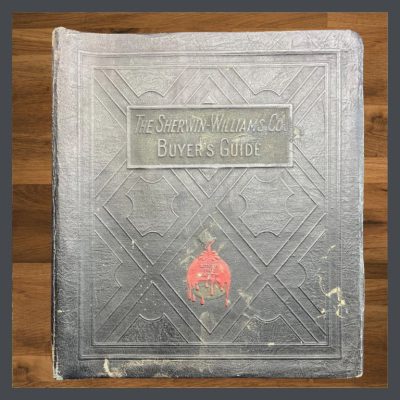
My mother, probably felt safe dropping her wild child off there for several hours because Sears had always been a part of her life. Offering rural mail order from 1886, I’m guessing that Sears provided my great-grandparent’s impoverished farm family with dreams of goods far beyond their reach. My mother often joked about how the catalogue was kept in the farm outhouse with the corncobs, scratchy, but effective, when, as a child she went to visit her grandmother. I have little doubt that my grandmother, busy with 3 children, took advantage of Sears mail delivery to clothe everyone & to obtain goods not available in her small town in West Virginia. Below is a Seroco paint catalogue from 1914. An inside page shows the colors that were offered. In part 5, I go to Seroco paints to demonstrate what I have written about color theory.
WHAT ABOUT PAINT COLORS FOR YOUR HOUSE? KEEP READING!
![]() Part 1, THE COLOR LESSON
Part 1, THE COLOR LESSON
How to combine colors on your bungalow to most enhance its features.
![]() Part 2, COLOR HARMONY
Part 2, COLOR HARMONY
Combining colors to please the eye.
![]() Part 3, THE ARTS & CRAFTS MESSAGE
Part 3, THE ARTS & CRAFTS MESSAGE
The philosophy behind the beauty.
![]() Part 5, WHAT ABOUT PAINT COLORS FOR YOUR HOUSE?
Part 5, WHAT ABOUT PAINT COLORS FOR YOUR HOUSE?
How to use everything you know about color to pick your dream colors.
![]() Part 6, PAINTING YOUR BUNGALOW EXTERIOR CHECKLIST
Part 6, PAINTING YOUR BUNGALOW EXTERIOR CHECKLIST
Making the big choices.
![]() Part 7, IT’S ALL ABOUT THE CHEMISTRY- LEAD PAINT IN BUNGALOWS
Part 7, IT’S ALL ABOUT THE CHEMISTRY- LEAD PAINT IN BUNGALOWS
Because I think I’m everybody’s mama.
Now head on over to Part 5. to put together all the information you have learned about color theory, with historic colors from the Seroco line. Adding the modern colors now available from Ben Moore, you will be able to formulate palette choices for your own house.
 STAY IN THE BUNGALOW KNOW!!!
Sign up for our newsletter & receive our FREE E-book, 7 VITAL Things to Do Before You Hire a Contractor.


The body of our house is blue / blue grey; our front door is chocolate brown; and the trim is white. Suggestions for shutter color, please. They are currently white, but I was thinking chocolate brown?
Hi Judy,
Take a look at Arts & Crafts pottery & see if you can find pieces in the colors of your house. I find that can give nice clues.
Are the shutters original to your house? They were unusual on bungalows.
Suzanne